Amazon Redesign
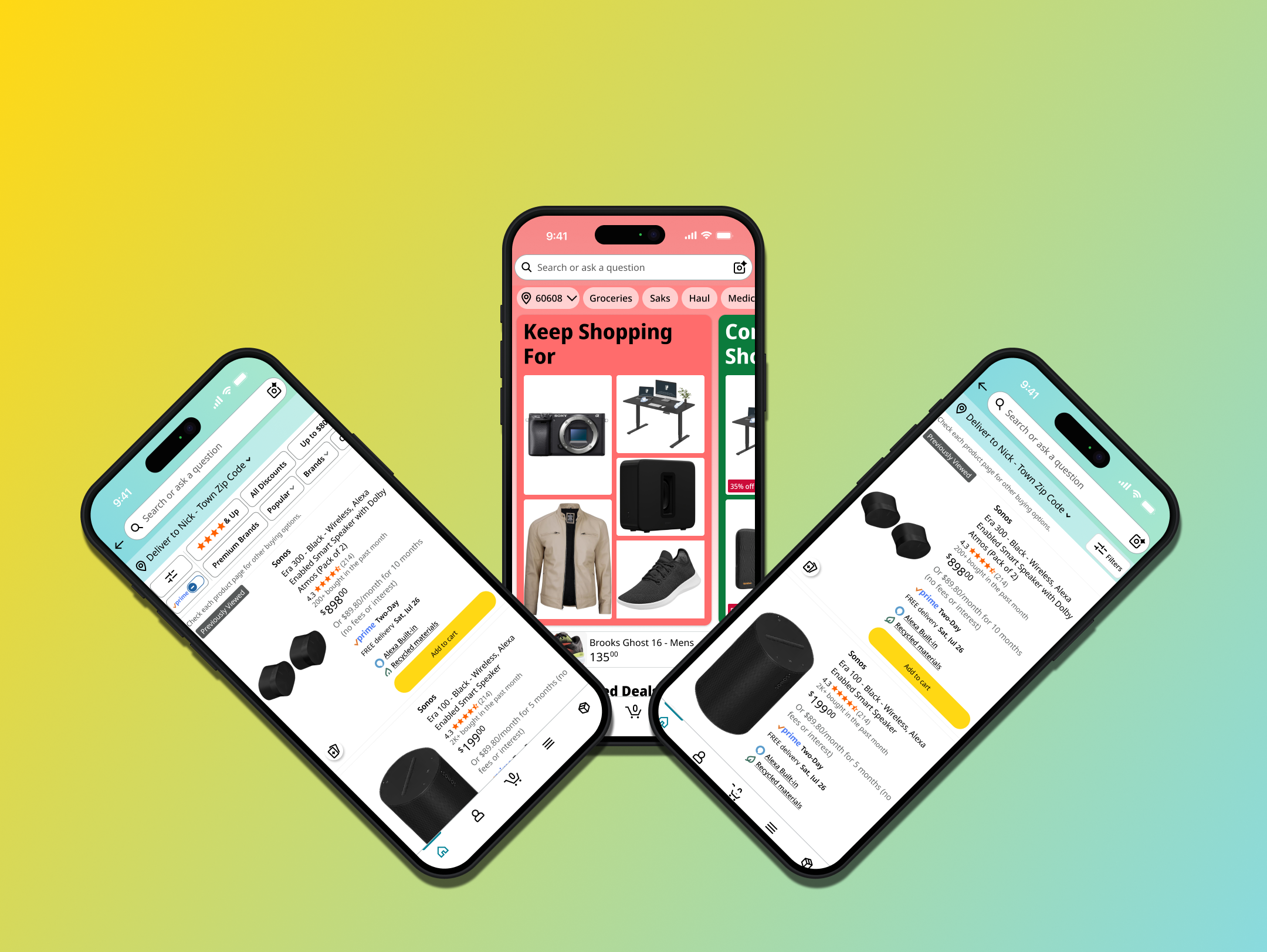
Problem: Amazon’s mobile app is exceptional at helping users discover products and driving sales, but several high-traffic areas of the experience create unnecessary friction for the Amazon’s customer base. The account management flow, product filtering experience, and orders view each suffer from the same or similar issues. These being the following: unclear information hierarchy, cluttered layouts, and navigation decisions that work against how users actually think.
Solution: Reorganize screens/flows to better align with user mental models, reduce scroll fatigue, restructure information hierarchy, and change information displays to be easier to navigate.
Impact: Testing on user group showed that the redesigns increased clarity in navigation and increased accessibility of high-use surfaces, with users consistently describing the experience as cleaner and more intuitive than the original.
Amazon's core navigation structure and visual language are familiar and trusted. Rather than reimagining the app from scratch, I preserved the established tab bar framework and interaction patterns, focusing changes on specific surfaces where friction was measurable and the path to improvement was clear.
What Was Working
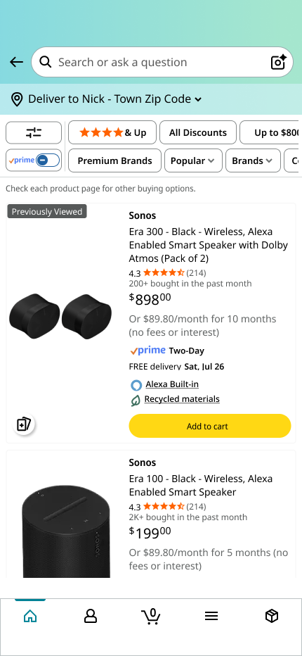
Amazon’s layout on the account tab is to show you a carousel of your orders, items to buy again, and generally more products. I can imagine they do this to try and drive the user to another purchase, however it directly conflicts with user expectations and causes confusion.
Users expect the account tab will take them directly to a list of options related to their account.
The current layout requires the user to tap the nav tab, then find the account chip and tap that as well
Account Page
Completely removed the intermediary screen Amazon shows you in favor of the account options list.
Aligning with User Expectations
I brought over some of the original design language with the Account Name header block as it signifies key account details.
Essential Info Kept
Addressing Scroll Fatigue and AI Expectations
Added a search bar to make finding settings easier.
Moved AI functionality into the heading bar from nav bar.
Orders replaces AI in nav bar.
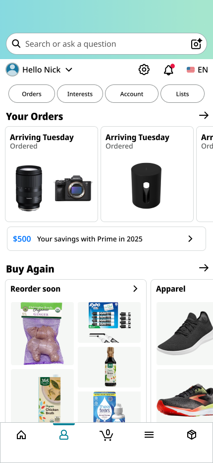
What Amazon shows you

What users expect
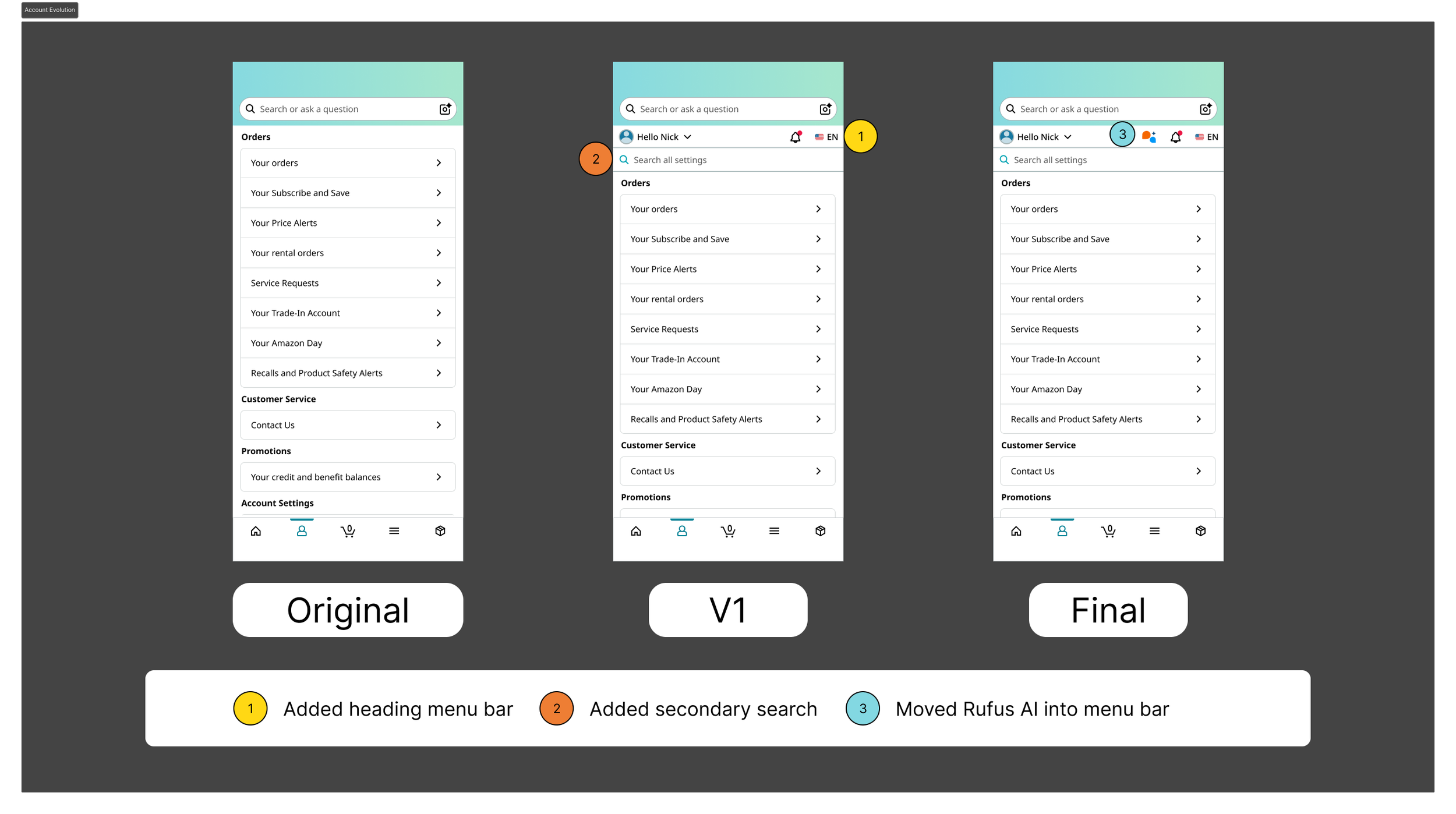
Impact: Navigational friction between account options and orders was no longer apparent. Users loved having the account and orders tabs be more easily accessible.
Moving AI functions into the Account header and Orders to the Nav Bar increased access to a higher traffic surface while maintaining appropriate feature organization.
Nav Bar

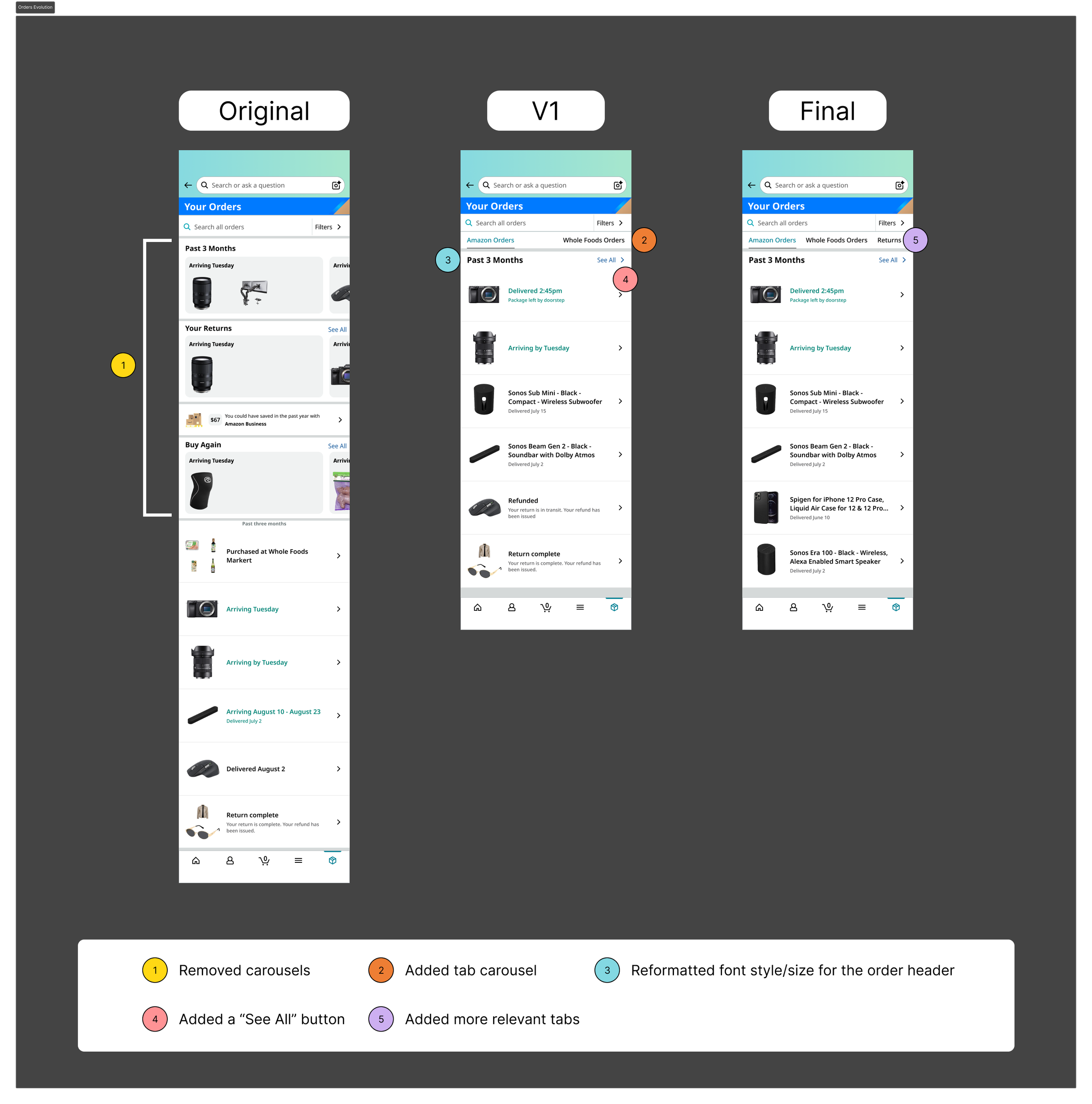
Orders
All order types are mixed into a single list with carousels for sub-categories are pushing primary content further down the page.
Categorized and Organized Orders
Introduced a secondary navigation bar at the top for users to tab between Amazon Orders, Whole Foods Orders, Buy Again, and Returns with a single tap.
Carousels removed for easier access to main content.
Impact:
Overall reduced clutter, confusion, and created a proper informational hierarchy driving user satisfaction.
An at-a-glance filters carousel mixes touch targets together and is generally difficult to scroll when holding a mobile device with one hand.
Difficult to read through.
Scrolling can be interrupted by accidentally tapping a filter with a drop down.
Product Filters
Original overlay presents filter options in a way that requires significant cognitive effort to parse.
Removal of the search carousel in favor of a single filters button to eliminate an unnecessary step in the filtering journey.
One Touch Target
Restructured the layout with top-down headers and scrollable chip sections. This was done to improve a users ability to scan their way through the content.
Condensed similar categories into single unified options to reduce redundancy.
Restructured Overlay Layout

Users championed the ability to read through the filter options easier.
Reduced cognitive load with carousel removal.
Friction still existed with the scrollable chips.
Impact
Hindsight and user feedback allowed me to see that keeping the carousels in the overlay caused it to be hard to see all the necessary information at once. This led to scroll fatigue and the improvement I would make here is to have the chips be one all-inclusive flat block beneath each header. I would then validate this with usability testing.
Metrics I would track to ensure success would be:
Time-to-task completions on the account settings flow
Filter engagement rate and session drop-off on product search pages in conjunction
Navigation frequency between order categories on the Orders tab
Usability testing on task completion and error rates would validate whether the restructured layouts are reducing friction for repeat users