Amazon Dark Mode
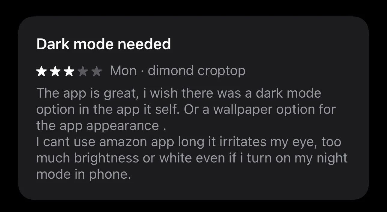
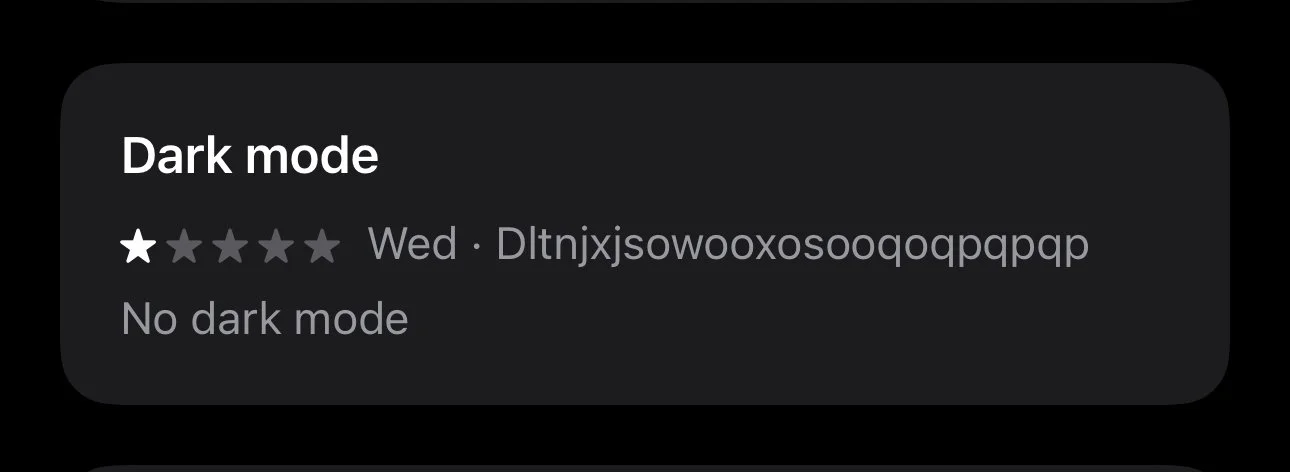
In researching why many online retail apps don’t feature any sort of dark mode for your late night impulse buys, I discovered one of the bigger hurdles seems to be the idea of color contrast with product images. I figured that Amazon, the worlds largest retailer, would have invested some time and energy to make their app a bit more accessible to their night time shoppers.
Checking through the app settings and searching around forums online seemed to tell the story that the feature didn’t exist yet. It may not exist but according to App Store reviews, it was in demand. Thus, my journey to try and design this feature began.


Color Palette Philosophy
The Needs/Goals: Retain color expression and stay within WCAG accessibility standards in a darker palette
Home Screen Observations:
Gradient that extends from the top of the screen to the base of the feature cards
Opaque whites for the chips near the search bar
Bright whites for elements with backgrounds or just the background itself
Can be pretty blinding at night/low light settings

Design Pillars:
Create a feeling of warmth while being within WCAG accessibility standards
This is important because product backgrounds still needed to be some shade of white so products could still be seen
Color gradients still needed to appear so it wouldn’t sterilize the app and create too much of a monotone experience
The app still needed to feel like itself, so color hues needed to be dialed back in brightness but still appear all the same
The Problems I Ran Into
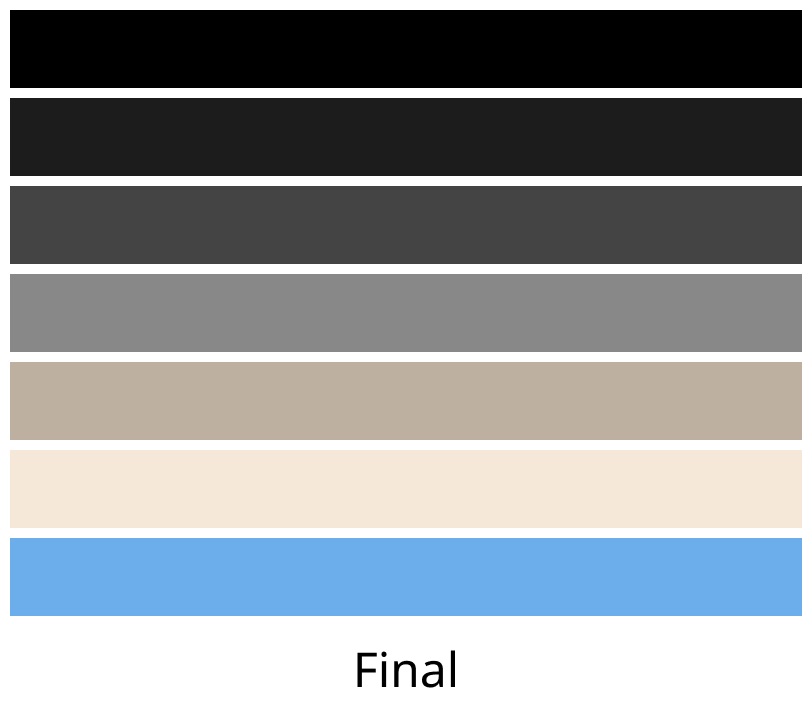
Problem 1: Light mode and Dark mode needed to have the same amount of mid tone variation and philosophy behind it and my palette seemed to be lacking variety
The first problem was that I realized in copying Amazons screen flows that they use a couple different mid tones for their stroke colors.
This seemed to be not to pull your eyes directly towards any element borders but have them still be visible
For homogeny between modes I adopted the same philosophy of “just visible enough”
Also keeping contrast in mind during this step as well


Solution: Adding another mid tone value on the lighter side based on research on industry standards and tweaking them to meet my needs
Thus I went to work figuring out how to create one more tone that was somewhere in the middle of off white and gray.
I dove back into doing research on other apps, industry standards, and also seeing if I could create something on my own.
Eventually I landed on using my own color. I took my lightest value and adjusted its place in the color picker so that it was a little darker and had a touch more of its hue color for some warmth.
This had the impact of being visible and not pulling the eye too much.
Additional Notes: The additional blue tone was a recurring blue for links and buttons, so I included it in the main palette
The blue tone that gets added and changed between versions was the color tone I used for any links/blue text buttons.
The original color didn’t quite capture the blue essence of the original color that Amazon uses, so I shifted to a different shade and hue of blue. This version was more based off the original hue that they used.
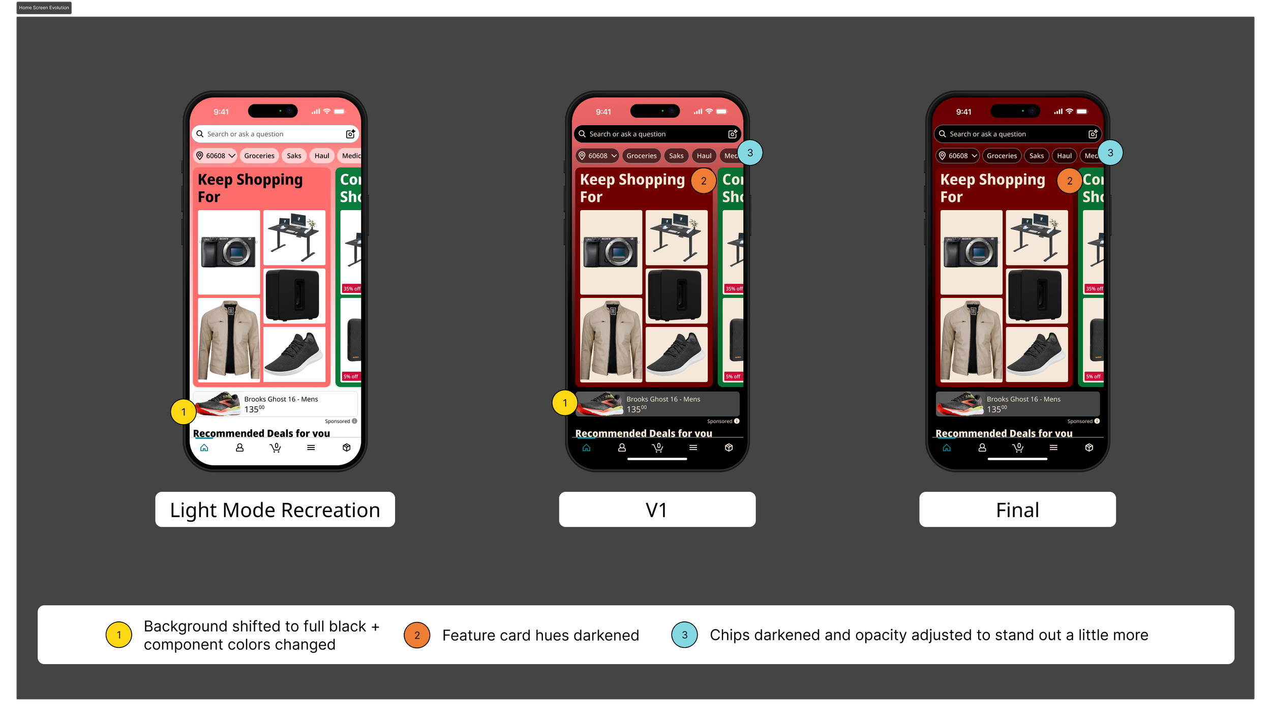
Problem 2: The colors for the gradient needed to be dark to fit the theme but also still be visible to distinguish themselves. The feature cards would also need to follow this philosophy as well.
As far as the color scheme was concerned I first tested the original gradient on the page but changed the bottom color to be the same black as the background. This seemed to work and looked cool but didn’t quite match what I had already done with the large feature cards.
I had darkened their tones quite a bit and realized here that hue of the first card almost matched the starting hue of the gradient in light mode.
Now realizing this, I chose to shift the first gradient hex code to be a touch darker than that of the feature card. This allows it to still stand out but keep the screen fairly dark as well. It lined up with the way the original was designed and matched up with my pillars of contrast and warmth while keeping some color in the app as well.
Solution: Shifted the start of the gradient to be a little darker than the feature card and the end of the gradient to be the same shade of the background
Problem 2A: The gradient that sits behind the feature cards needed to stop at the base of those cards without continuing to maintain position as the user scrolled
A secondary problem to this one was figuring out how to get the gradient to appear in the same fashion as the original where it both disappears when you scroll past and that it comes down to the correct spot on the page and stops. Alongside this was getting the proper fill and blur for the search header.
V1: Linear gradient continued to be present despite scrolling and the header background blur did not blur much of anything
I tried having the whole screen frame have the linear gradient and having the end of that fill sit just above the sponsored ad component. The problem here was that the gradient remained in a fixed position on the screen when the user scrolled
I also gave the search header a default level of background blur and a 40% opacity of an off-black color. This resulted in a blur that barely blurred anything at all.
V1
V2: Increasing blur to maximum and decreasing color opacity in the header to 1% percent gave the header the blur effect for items scrolling underneath it, but did not address the gradient issue
1) Increase the blur from 4 to 100 to see how much that helps or if its too much
2) Lower the opacity from 40% on the off-black fill to 1% to see how much more the gradient comes through it for the sake of seamlessness
These proved to be helpful, but the gradient was still locked to the top of the page. However, this did solve the search header blur issue. It now gave off the frosted glass vibe when items scrolled behind it and the gradient showed through it much better. I still hadn’t reached a proper solution to this problem until…
V2
V2
Solution: The feature card container needed to house the gradient not the whole screen. This allowed the gradient to scroll with everything else
I realized I didn’t need the whole frame to be a gradient.
I just needed a container that sat at the top of the page and extended just below the feature cards.
This would house the gradient, feature cards, and chips.
This allowed the gradient to scroll with everything else
Final
Problem 3: List items needed some contrast between them and their backgrounds so that the start and ends of lists were clear like the original
A problem I ran into in designing dark mode for the orders page that I felt as though there needed to be some level of contrast between the list items and the background just so they would stand out a little bit more and be more easily delineated. Related to that was the idea that things should still feel relatively homogenous with the light version as well.
V1: Lighter components and lighter backgrounds for contrast did not look good nor keep things dark and contrasting enough.
I initially tried lighter component colors and a lighter background color to contrast it all. I didn’t think this looked great nor did it have the right amount of contrast and darkness to it.
The contrast and brightness didn’t quite add up visually and it didn’t feel as in line with the light version.
V2: Darker components with the same background shade was moving in the right direction but wasn’t as homogenous with how light mode handled its contrast as I hoped
I tried darker components with the same background to have better contrast.
I thought this would get me closer to a look that felt similar to the light mode version.
It did but the background still felt a little too bright.
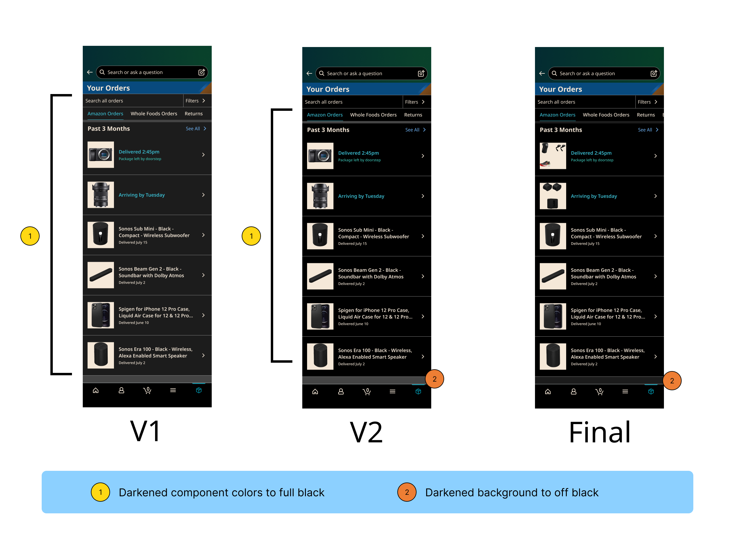
Solution: Darkening the background further and allowing my mid tone stroke color to delineate the end of the list created the homogeny and look I was aiming for
The final iteration darkened the background to the off-black color in my palette and this immediately struck me as closer to what I felt was the proper inversion of color tones from the original.
I took a bit of time as well to compare hex values between the two white tones of the original and the two black tones I was using. They were in the same ballpark as one another and it looked better too.
I then allowed my stroke mid tones to delineate the end of the list. This looked more homogenized between the colors and contrast of the light version.
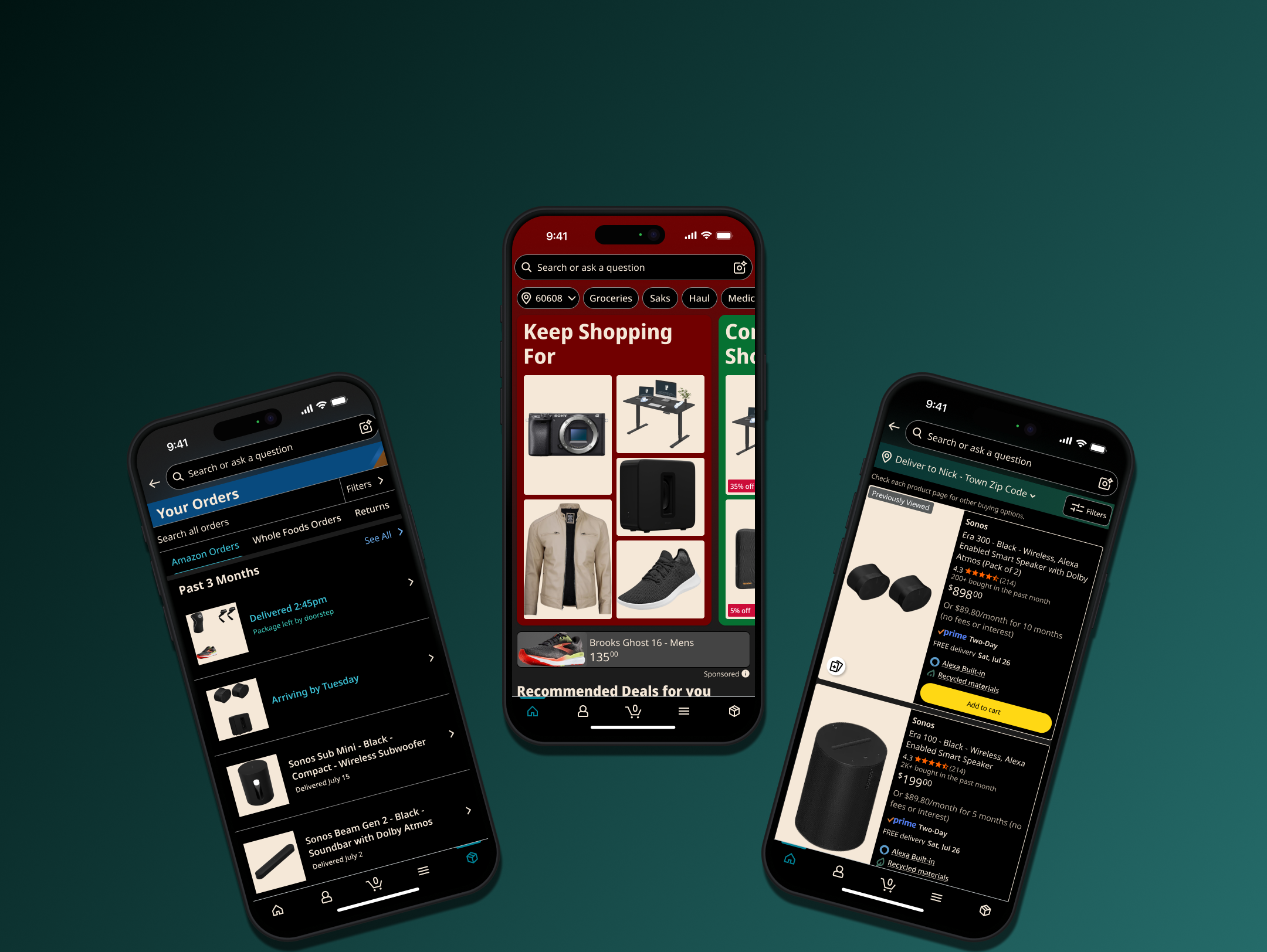
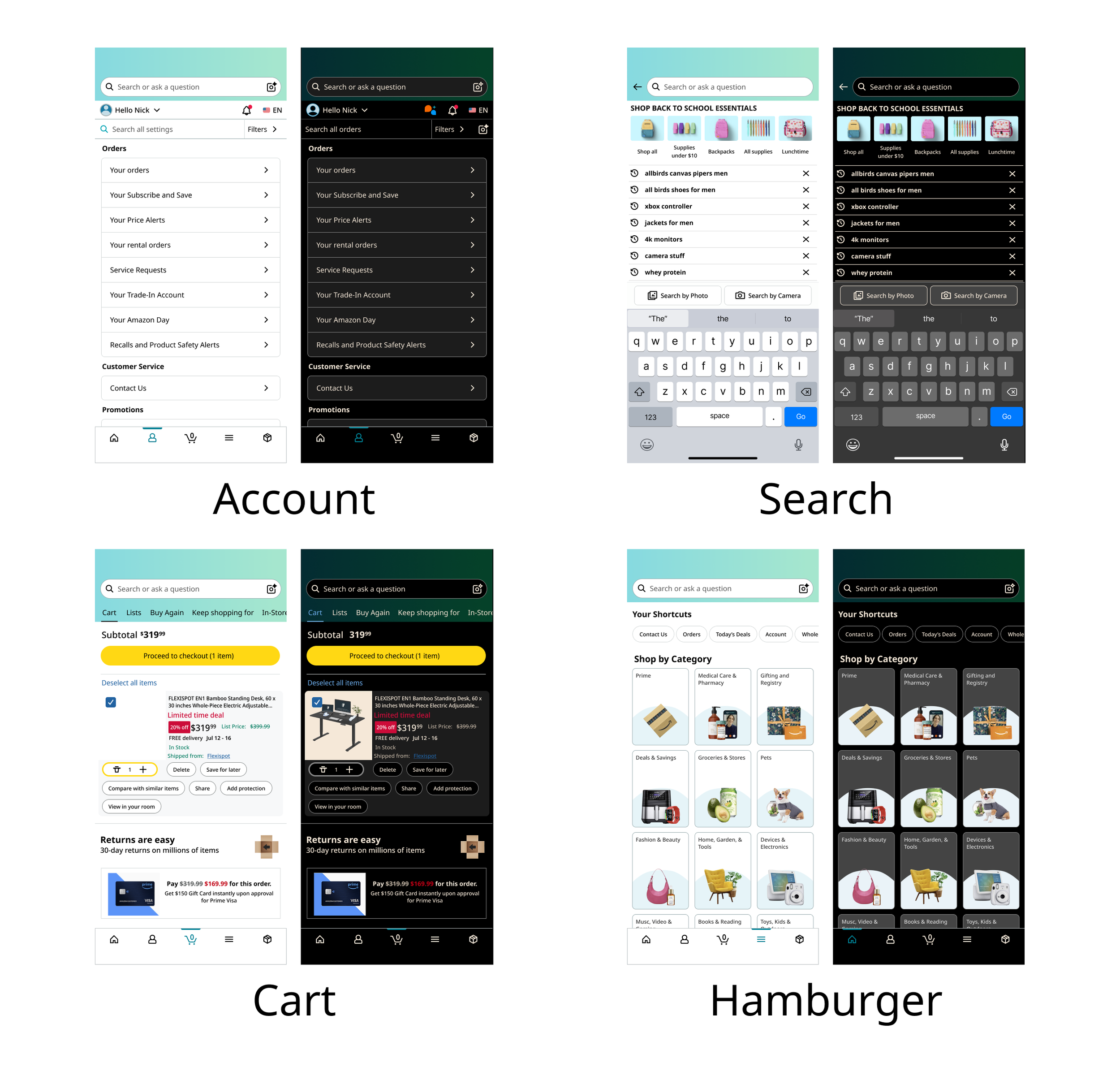
Okay but what about some of the other screens within the app?
Search Results
Product Page