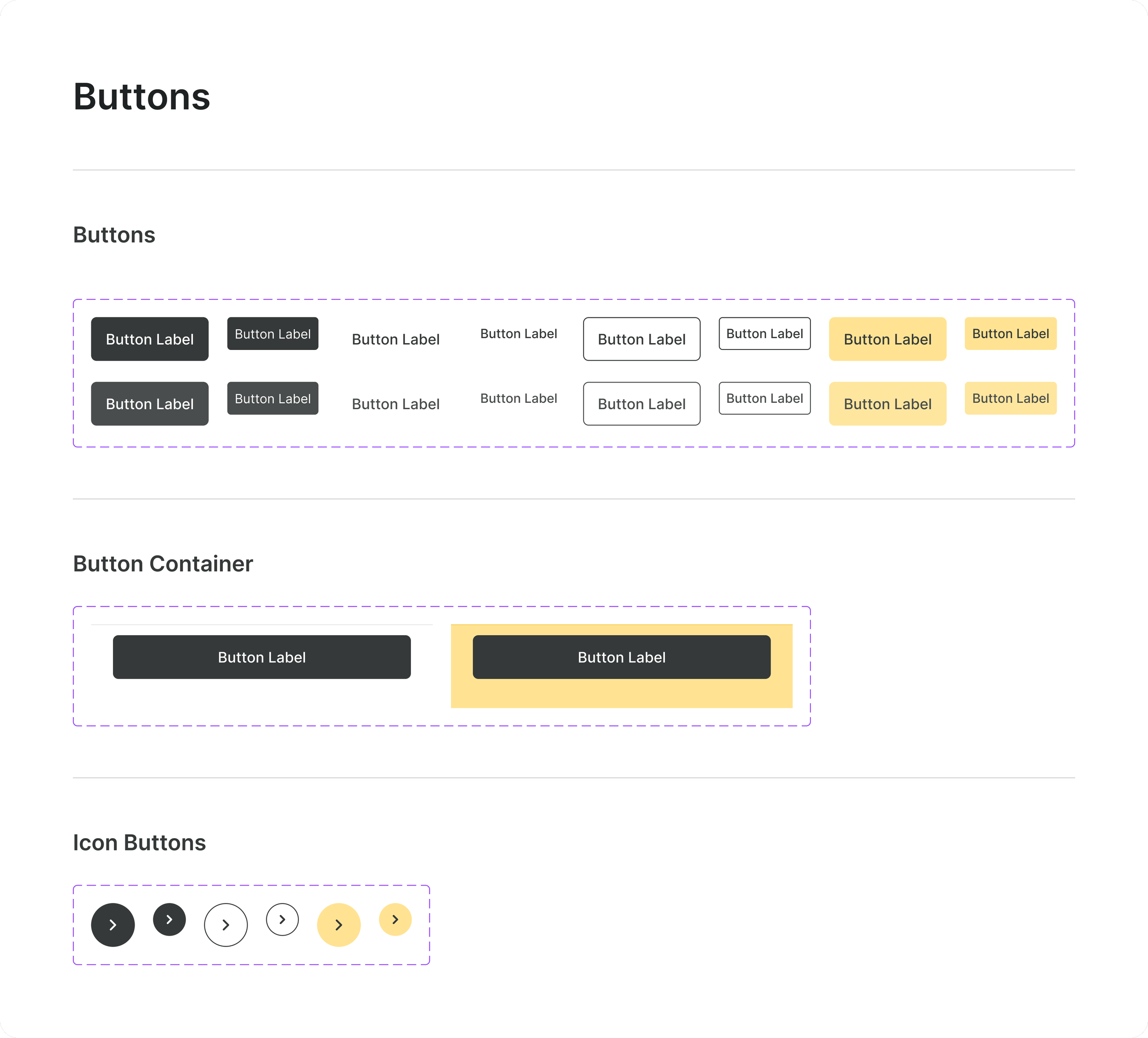
Adventus
A simpler shopping experience
What is Adventus?
An online shopping app that was designed by me to facilitate a faster and more streamlined shopping approach. I took inspiration from my time in college and asking the busy people around me over the years what they would want out of an ideal online shopping experience. They would go on to tell me things like: if being onboarded to an app was quicker I might sign up for an account with X retailer or if checkout was really quick and there was less hoops for me to jump through I would shop more with Y service. This was my first ever design project and something I have revisited to see what I could improve upon. I learned a lot from this and I understand there will be much more to learn as I grow in this field of work.
What were the main goals of designing Adventus?
Easy and efficient onboarding of the user. Making sure they could log in or create an account as quickly as possible. Having pain points with the user experience before you’re even using the app would mean loss of real user acquisition and retention.
Quick conversions from items in your cart to a sale was a large goal in the process. Keeping things quick, concise, and predictable would be the biggest pillars in the checkout flow. It also had to follow basic guardrails to prevent accidental purchases. No unexpected hurdles to jump over, no lengthy checkout.
Also creating lists was something I personally like doing when I shop and I wanted to make sure that if someone was to make a list they could very easily just add all those items to cart or invite others to see them. Sometimes you have a holiday coming up and you have to buy a bunch of stuff for people you love and it would be nice if creating lists and buying items from them was simple and easy. This feature of the app was pretty personal to me as I feel some other online retailers don’t do this particularly well.
Onboarding Flow
Problem 1: Onboarding flows need to meet users mental models while being concise
The concerns that occurred over time for getting this right were:
How long is too long? What information does the app need to just get you going
What steps does the user need to go through as opposed to optional steps? Where might friction be expected?
How does the user skip steps if they don’t want to complete them?
If they hit “skip” how far into the process does that take them?
If a user decides to exit out of creating their own account, what happens? How does the app respond to a guest?
I started to investigate more of what other apps try to do to get people moving faster and here’s what I found:
The option to connect a different account was prevalent
All you had to do was sign into your Google, Facebook, or other account and you were 90% of the way done or fully done.
This pushes people through signing in/onboarding quicker because they are much more likely to have these accounts and more likely to use these over creating their own with a new service
That likely alleviates onboarding/registration for most people, but what if someone didn’t have one of these other accounts? How do we get them to get through the app easily? The steps/questions asked had to feel somewhat predictable.
The proposed solution: Progressive disclosure when it came to filling out personal details and granting the user agency in how much information they were willing to provide
Progressive disclosure and user agency were the first idea
Steps needed to be clear and concise
Users needed to not feel forced into parts of the process they didn’t want to be
After wire framing the process, I realized it may have become too lengthy but decided to test this as my first draft to see how many problems arose

Did it work? No, because the process length was left unclear leading to frustration
In testing this on friends and family, I got a really good question.
“How do I know how much of this process is left?”
This was confirmation of the process being too long.
A quick win would be to add a progress bar with a step counter.
This way when I did make the process shorter, the user could still see how much is left regardless.
I also asked what felt like too much to do in the onboarding.
The feedback I received was along the lines of “having to input all of my personal details makes me want to use a different service for convenience.”
Version 2: Progress bar with step counter, delineating skippable steps, and removing the need to input all of your personal data led to more flow completions
In this iteration I included a progress bar with the step number and cut out everything after an email and a password besides interests and a profile photo.
Optional steps were marked as being optional and skippable to the user.
A shorter and clearer process granted more flow completions
The progress bar allowed users to be less frustrated with knowing how much was left
A new problem arose: a user wanted to exit the whole process and see the app as it was
This was a problem because I did not think about users wanting to beeline past onboarding to check things out first
The exit button just brought them back to the login and create an account page with no way to fully exit it.
Fixing this oversight required the exit button to fully exit the process and having a skip button at the beginning so that you can just immediately exit onboarding/login.

The MVP before adding color and aesthetics: Less hiccups, more flow completions
Retesting led less hiccups and even more completions. This MVP and its final product also continues to follow the idea of progressive disclosure in which only the appropriate information is being displayed to the user in each step. Heres what that looked like and also heres what the final version looks like as well.
Having the intro pose problems and how the app will solve those gave some more emotional engagement to the process as well. It felt a little more personalized. The progress bar being animated was a good little micro reward for the user that fit into that emotional engagement piece as well.

Onboarding start to finish
Skipping through Onboarding
Checkout Flow
Problem 1: How to make the checkout process seamless and concise for a brand new user
I started creating a rough iteration of the flow piece by piece and as I had finished up the general thought process I realized I may encounter some friction with how I had presented the flow.
There was an immediate question of friction with payment and shipping for a brand new user.
New users would have no linked account to pull any information from.
It felt to me that this would be a pain point and probably lose sales and users (if it was a real app).
So how do we still skip this step for new users?
Proposed Solution: Ability to link your virtual wallet to follow users mental models and shorten checkout time
Many other apps use third party virtual wallets like Apple Pay and Google Pay to pull from. This prevents users from having to manually input or change their information across various services.
This would cut down on first time checkouts and potential subsequent ones
Creates a quick and easy means of adding your payment and shipping information
The only thing I could think of was that if the user for some reason or another had not connected a virtual wallet to their device, they would still need to go through the process of inputting or autofilling that information one way or the other. This end of the issue seemed unavoidable but the feature should still lower friction for a percentage of users all the same.
Version 1: No virtual wallet linking did indeed cause long checkouts times and would need actual implementation
The first wireframe iteration of this did not include this as it was an immediate afterthought. So there’s not much to say here other than the process gets a little long with inputting information and it would be a genuine point of contention.
I should also note that with this being my first start to finish design project, I forgot to keep an iteration of these flows that occurs between me finalizing components for this part of the app and the next version you’re about to see. So while technically a version 3, I am calling it version 2 just to avoid any labeling confusion.
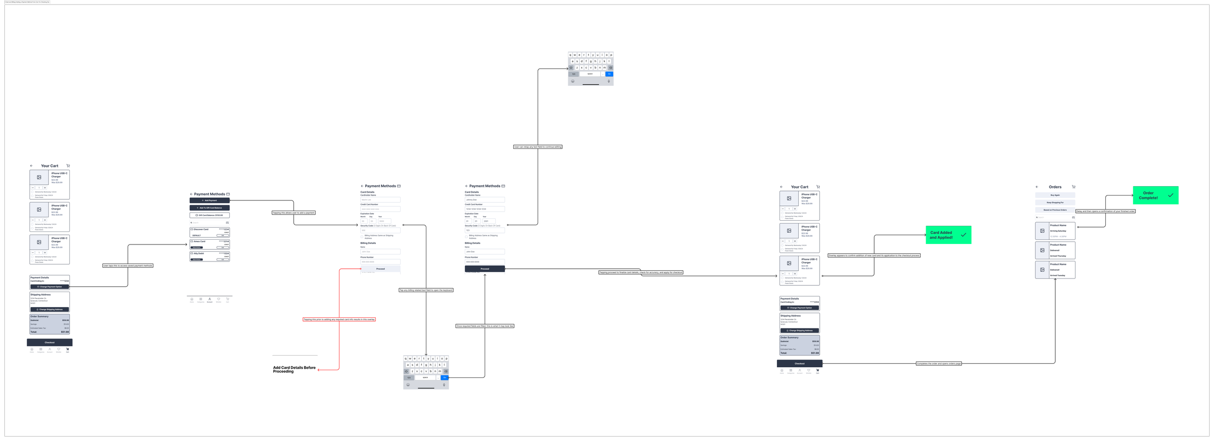
Version 2: Linking virtual wallets and improving accessibility created the intended effect of faster checkouts but the order of operations was wrong
Between versions accessibility became more of an emphasis on readability and touch areas:
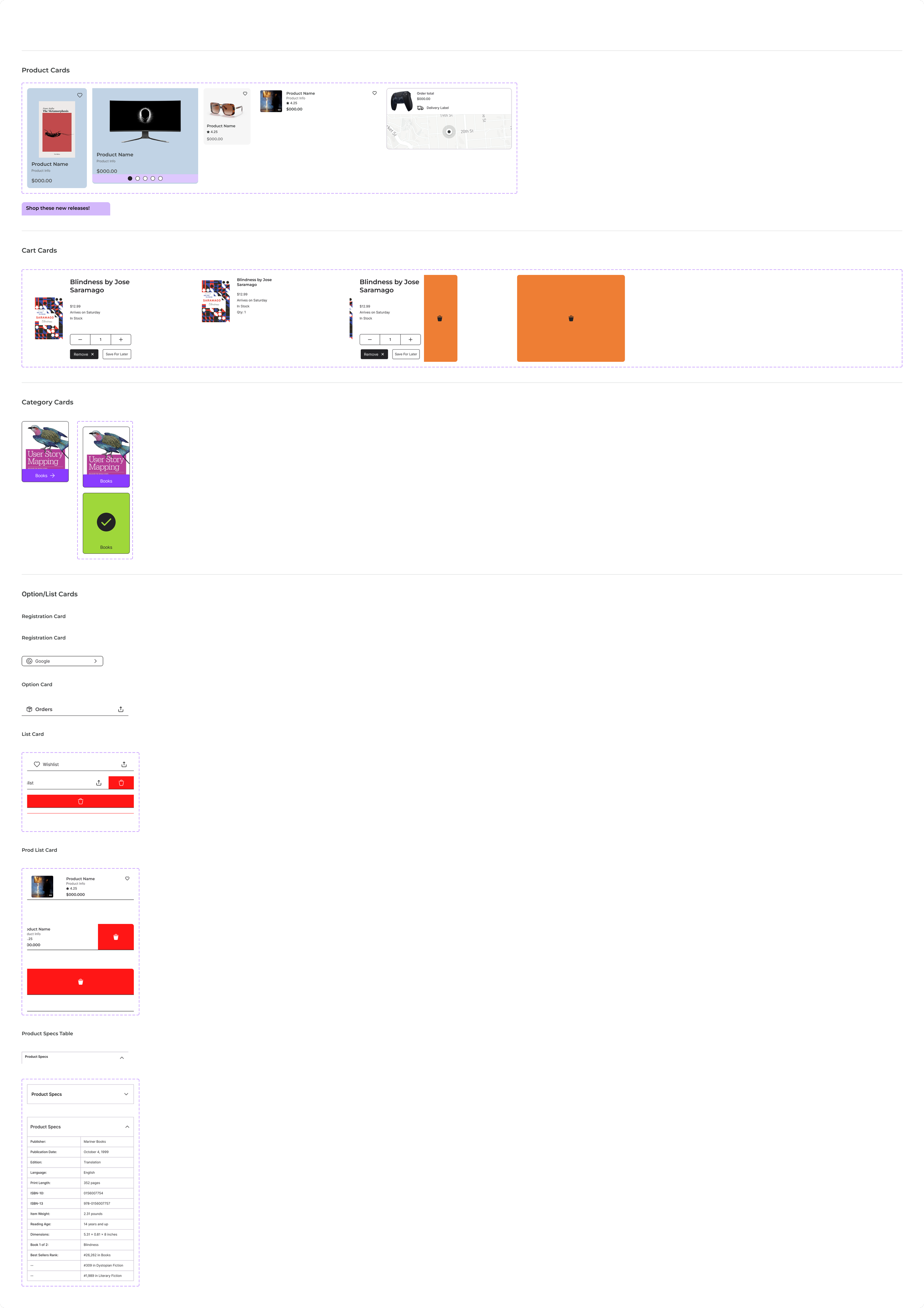
Cart cards got lengthened to use more of the screen real estate and have easier to tap buttons for accessibility purposes.
This version includes the virtual wallet payment methods and also the option to add a credit card as well.
I had designed this flow as something where you could verify your payment and shipping first and then proceed to an order review.
Testing revealed that the virtual wallet payment verification was a step too soon, forcing checkout completion before you had reviewed your order
This is due to them opening their own verification windows and completing those automatically completes the transaction
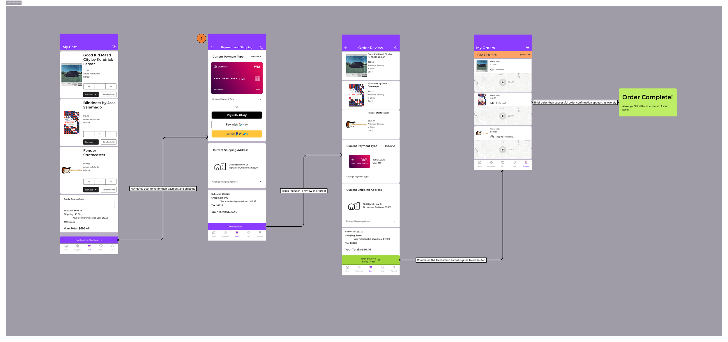
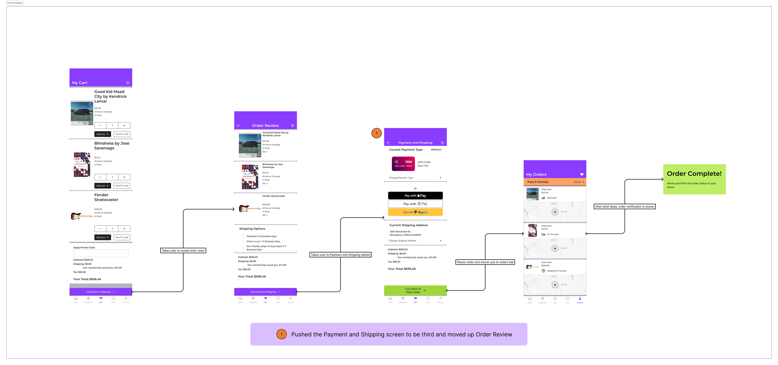
MVP and Final Version: Moving the virtual wallet one screen further into the flow while making the order review clearer and using screen real estate improved both form and function placing this design in a usable state
This one shifted the first screen post cart to be the order review and the second to be verifying your payment and shipping.
The order review removed the shipping address and instead replaced it with shipping options.
In revamping this part of the flow it became clearer how long it would take for an order to arrive and how you would be paying for it.
I also decided in this version to make the credit card graphic smaller as it took up quite a bit of screen space initially.
In considering the motion for this I opted for the standard Move In dynamic but I animated matching layers so that the headers had a clear effect to them to let you know you had entered a new page.
Shared Lists Flow
Problem: Making sure that a user could easily see who was invited to certain lists and what their access to them was
The first question after designing the lists page was “what would be the simplest way to share this with someone else?”
I wanted to keep this theme of making things intuitive and easy to see/access.
I sketched a few ideas:
The share option being directly inside of your lists in a settings tab
The share option being a singular button next the lists header
Placing a share button next to each list.
Version 1: Share button being tucked inside of lists took too much time to reach and back out of
The first sketch of having it be tucked away inside of list settings felt like it would take too many taps to get to and wasn’t particularly obvious.
I was really looking for this to be as simple as possible and I wasn’t sold on this idea yet so I didn’t bring it into the wire frame stage.
Here’s what that sketch looked like for the flow. I went ahead and brainstormed further and thought maybe a quick share button would help out here. It was then that I entered the wireframe stage.
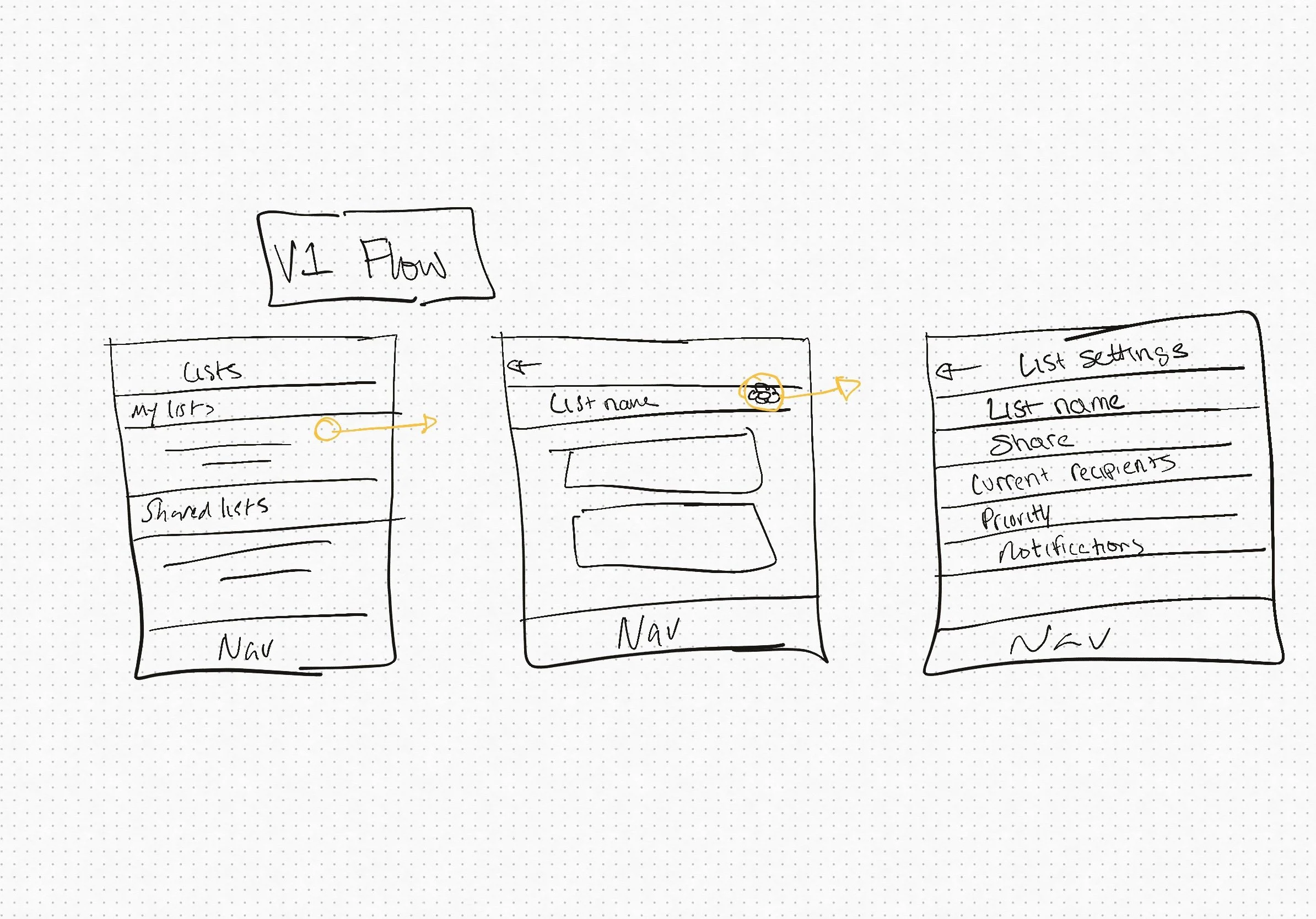
Having a single button next to your list headers seemed like a decent upgrade over the last sketch with it being front and center now. However, confusion started to arise with what its function was:
People were unsure if this meant they would be sharing all of their lists or not.
So far the pros to this approach was better use of screen real estate and quicker access, but the con outweighed it.
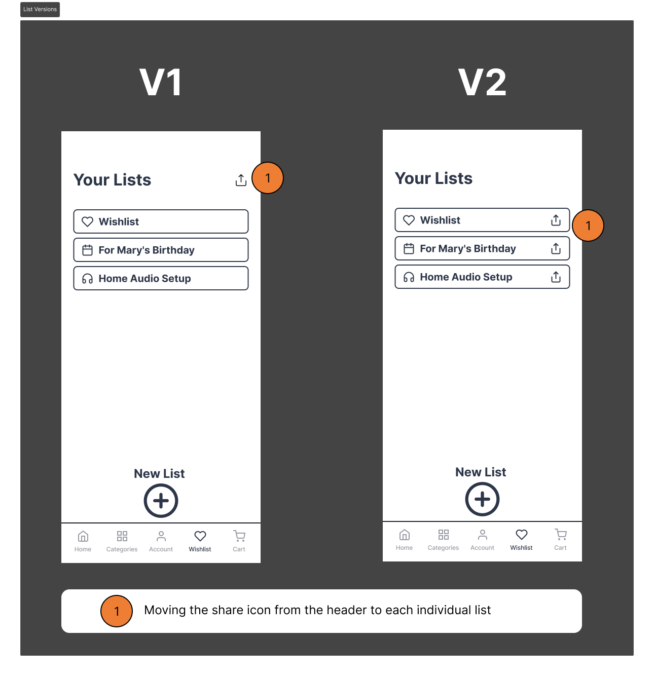
The next iteration would slide the share icon to be next to each individual list
This made the function more obvious to users after testing with friends and family
It retained the aforementioned pros to its placement
Thus the MVP was born.
Version 2 and MVP: Moving the share option to be next to the heading made it more easily seen at the cost at its function becoming less intuitive
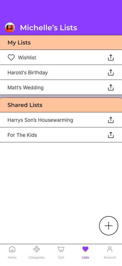
Final design: Adding some color, aesthetics and some breakage between sections allowed this page to feel more pleasing
After finalizing the look of the screen and making some subtle changes for aesthetics this is what I ended up with.
Some headers were added to delineate between your lists and ones that have been shared.
Keeping the share icon next to each list just like the previous iterations as well.
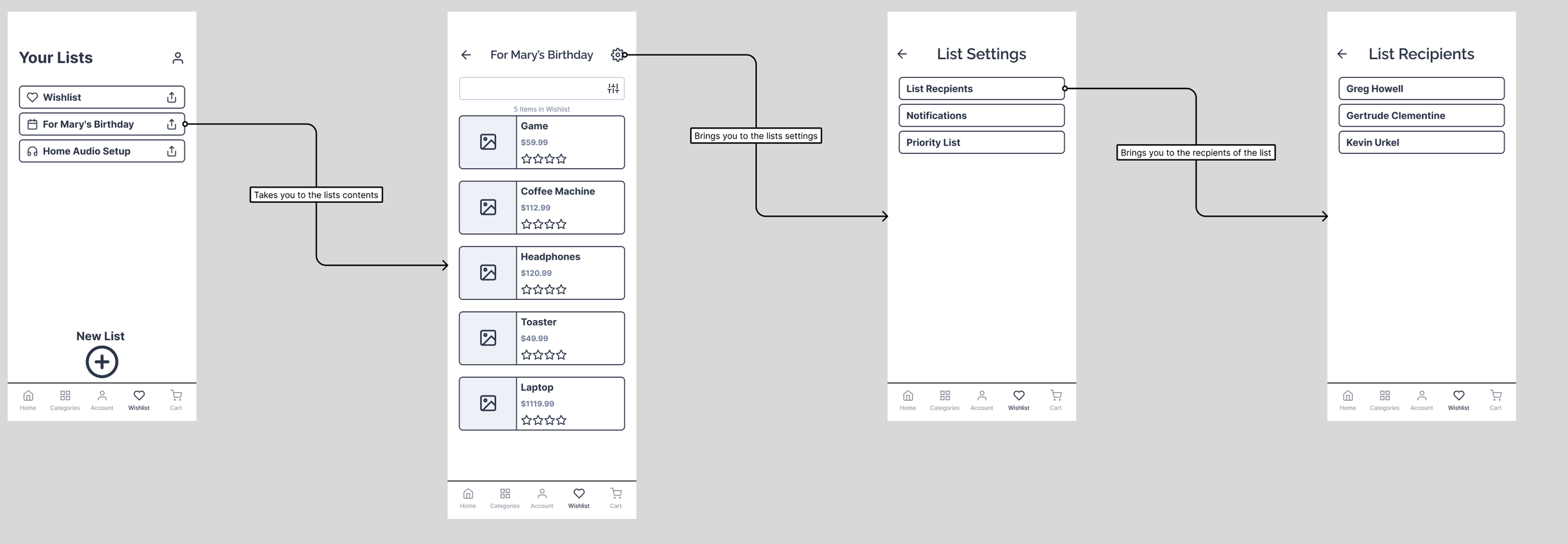
Problem 2: How does the user see who is invited to their list and what privileges they have?
This was a problem that I thought could be solved with a list recipients tab and the names of the people that you invited along the way.
The questions were these:
Where should this tab exist within the list menu?
How can I convey what access these recipients have as “at a glance” as possible?
Everyone leads busy lives so quick and easy information was imperative.
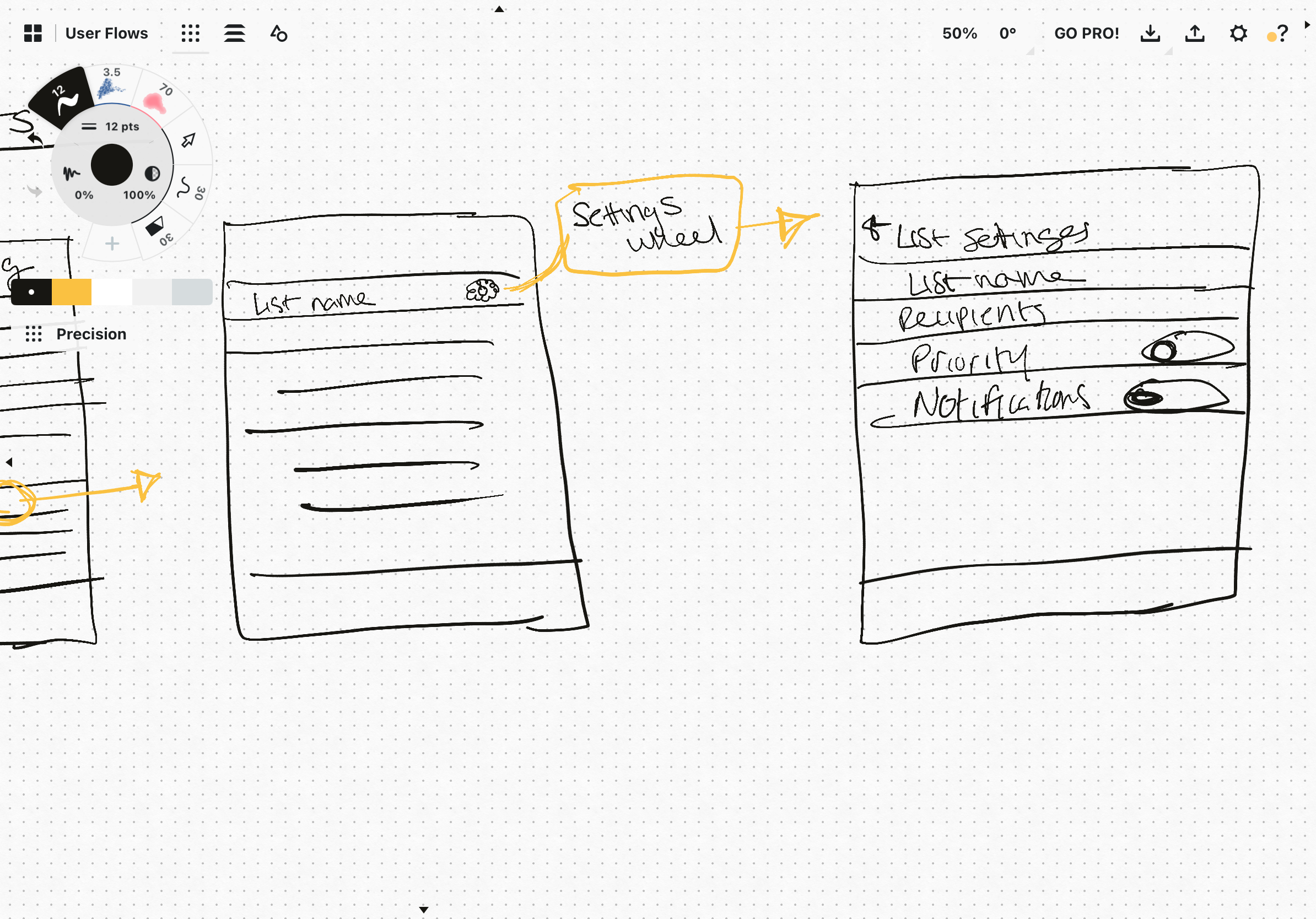
Version 1: Having a settings tab within each list started to create some hierarchy and made it intuitive that each list had its own settings
I dove in to answer the first question. I figured that each list having its own settings would be an appropriate place to start.
So within each list there’s a setting wheel that can be tapped to access a handful of simple settings. In here would be the list recipients. Now the name that gets displayed for each recipient would be directly tied to their account name and would be displayed as a list.
The remaining problem was articulating each persons access settings to the list.
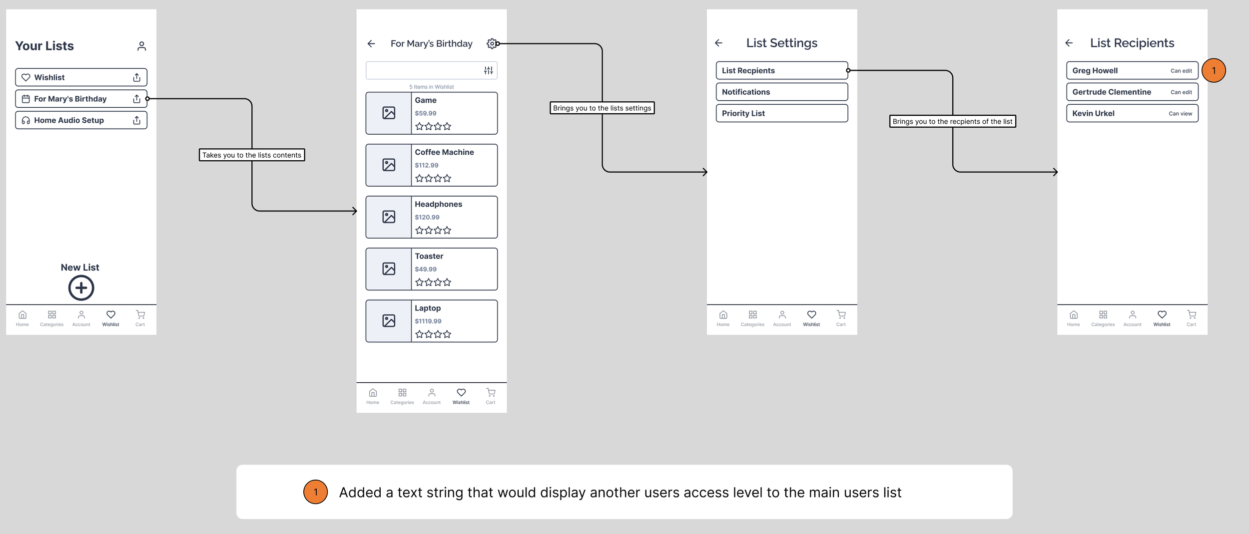
Version 1.5: Using words to display access privileges may add too much text causing readability issues
After that first version was done it was time to try and answer the second question. How easily can we make the access privileges be shown? I thought placing words next to every recipient would solve the problem - or at the very least get us closer to solving it.
Words like “Can View” and “Edit.”
The main feedback here was that if someone has a long name it might get wedged near the access status. Then it becomes one long line of text essentially.
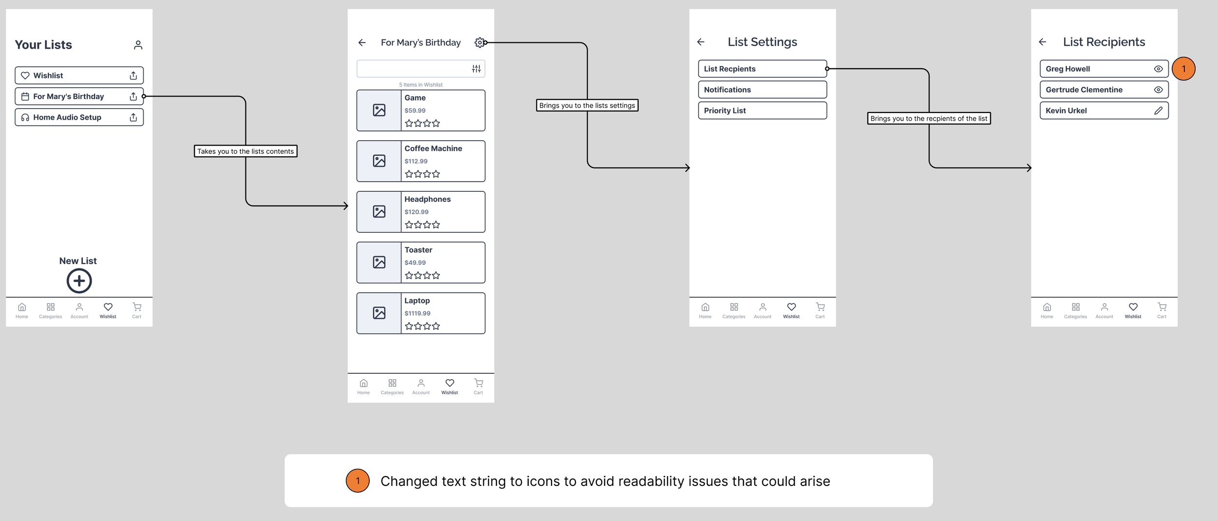
Version 2: Iconography next to recipients made was a quick and easy win for displaying access privileges
I realized that I could use icons to convey this to people instead and it would free up some space for those longer names.
Tapping the icons would also toggle through the the two choices you had as well - editing and viewing.
Feedback was that it seemed like friends and family were pretty sold on this design so it made its way to the final stages of design.
Final version: Color, animation, and general aesthetics were added to a proper MVP

With a more finalized look and feel to it this is what ended up being the final product for the lists flow. Below that is the animation interaction I mentioned
Flows, Animations, and Micro-interactions
Home Screen Navigation
Each time a nav bar item is selected it highlights itself, moves to the appropriate page, and deselects the previous nav bar item.
List Items Being Removed from List and Added to Cart
It was important that the user is essentially asked if they want to remove the items from the list once they’ve added them all to cart. This way they can have a clean slate in this list if they would like to use it again.
In a similar prompting, the user is asked if they are sure they want to remove all the items in the list when they tap that button. In both instances once the items are removed from the list and they disappear from the screen, the “Remove All Items” button is replaced with an “Undo” button in the event the user made a mistake or changed their mind.
This gives the user an easy win from a design standpoint because they have access to quick options in both directions for adding and removing.
List Item Removal Animation
I incorporated the swipe to delete feature that is common amongst other applications for ease of deletion for the user.
This way there isn’t extra buttons or UI elements to clutter the screen or the list items.
It also follows the mental models other applications have created previously which reduces potential friction.
The idea was that it presents list items clearly while still giving the user options to remove items they don’t want anymore.
The interactions I want to highlight here are that the heart icon for saving something to your wishlist can be toggled.
The versions of the product (hardcover, paperback, etc) can also be toggled. It lets you know what has been selected by highlighting in green.
Finally is the micro-interaction of adding the book to cart. The button shifts the icon to the right, changes to green, and has an animated checkmark that spins before eventually animating back to the original button.
Also you’ll notice the cart icon updates here as well. This little animations and icon updates give tangible feedback to the user and also feeds into a little more emotional engagement.
Product Search and Adding to Cart
Here the filters overlay opens via the icon next to the search bar. It indicates to the user that this is a different style of screen by moving in from the bottom of the screen.
It also has an “X” icon to close it and various options for the user to interact with.
Radio buttons and checkboxes are present for different types of options. Both animate to show if they have been selected or deselected.
The overlay when it is closed will move opposite of its initial direction to show that it is being closed. This way the user can easily select the results they wish to be shown and theres feedback for those selections.
Search Filters
