Nick’s Wine
Problem:
Learning enough about wine to inform your past and future purchases is a daunting task. It’s hard enough to select a wine you like, much less select one that’s similar.
The Goal:
Nick’s Wine is a passion project that overcomes these hurdles by allowing you to learn about wines as you find them and as we recommend them to you. Every product page has information relevant to the wine, vintage, and its main varietal.
Result:
The test groups love the concept and layout. They believe that a product like this would make them more willing to try new wines and expand their horizons.
Notes:
The product was continually tested on a group of average wine consumers.
User Research
Working as a wine consultant and assisting 35+ customers daily and 60+ during holiday seasons yielded a few major takeaways:
Some don’t know enough about wine or what they like to make informed decisions.
This makes it hard for them to buy/try new wines or remember some old favorites.
People like the in-store experience because they can more easily ask for help.
For some this also meant they had a distrust of purchasing wines online.
Some don’t drink wine, but their significant others do and they end up being the one to buy bottles for them.
Not knowing their SO’s taste or having an accurate way of tracking their taste profile makes shopping for them difficult and time intensive.

User Personas
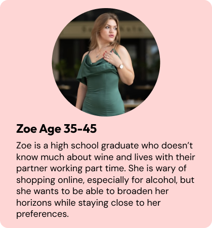
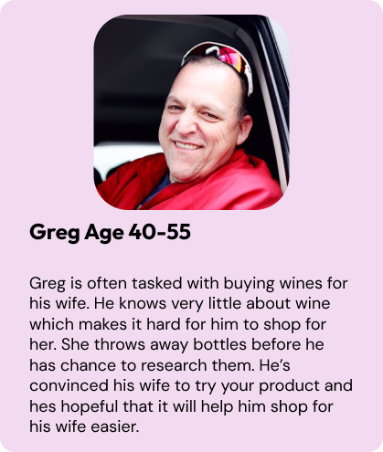
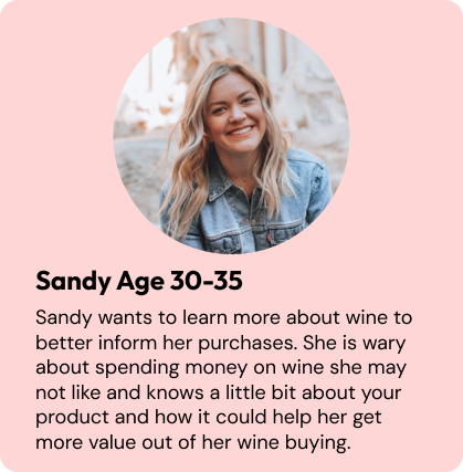
Thematically these personas are asking for transparency, trustworthiness, and education in buying and selecting wines. The goal of the product has now been set to achieve these three things.
Lo-Fi Designs
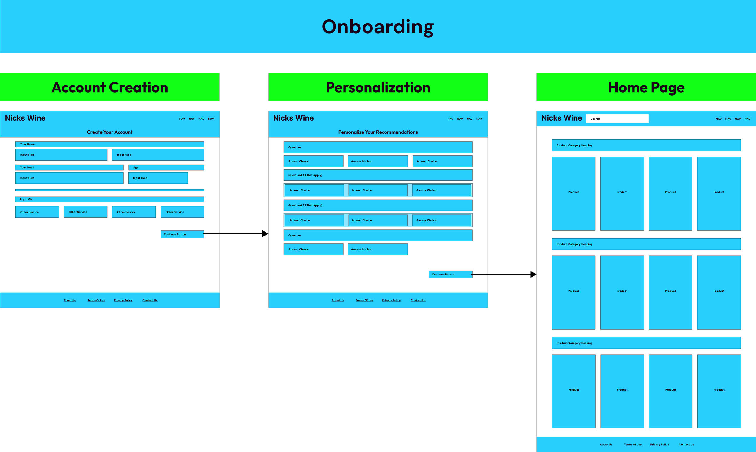
Creation of an onboarding system that drove immediate and apt recommendations was imperative to being the first way of addressing each persona.
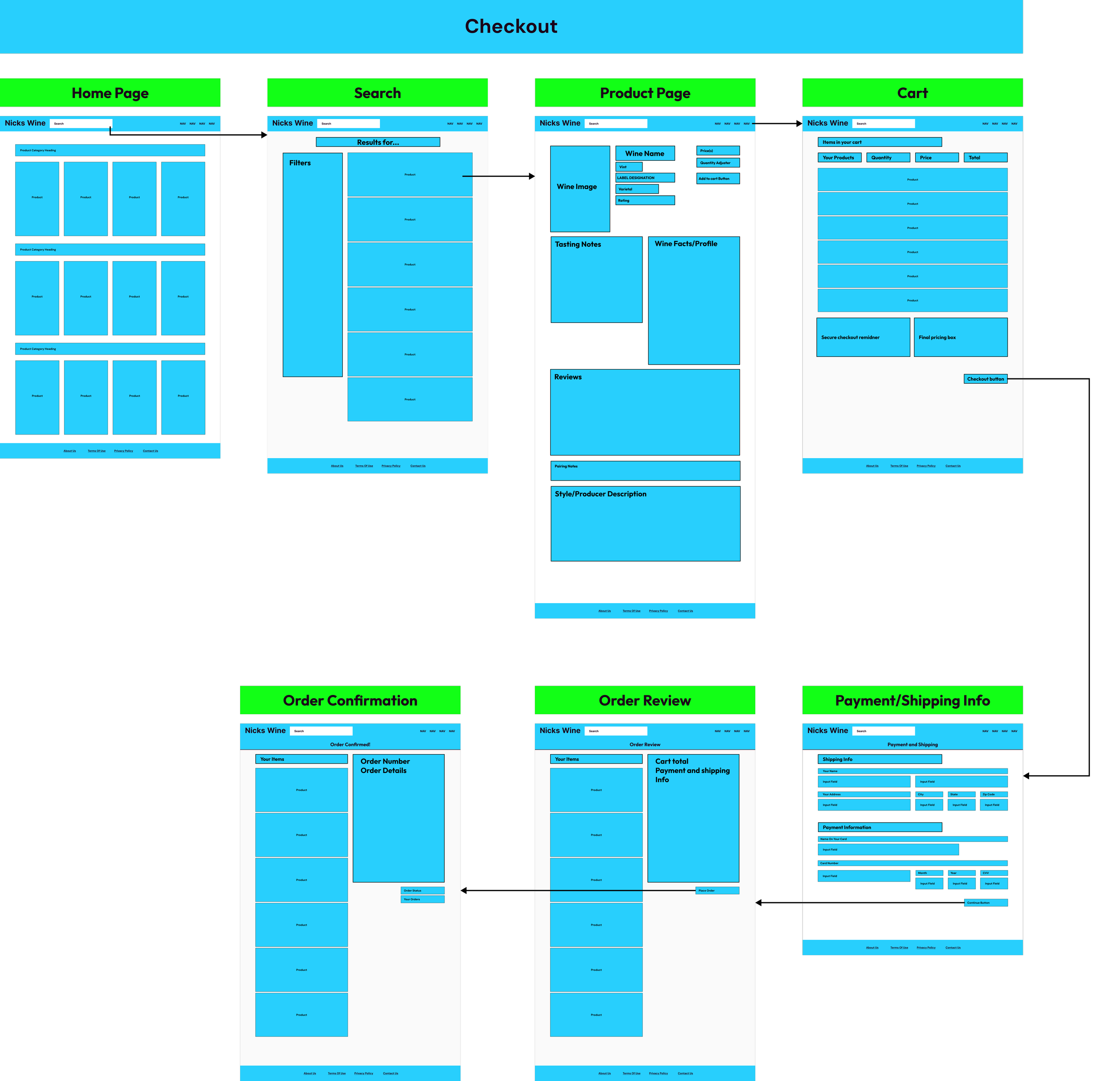
Second to that was a checkout experience flow and experience that was trustworthy, secure, and gave you all the information you’d need to feel good about your purchase.
Design Iterations
Cart
Lo-Fi Cart
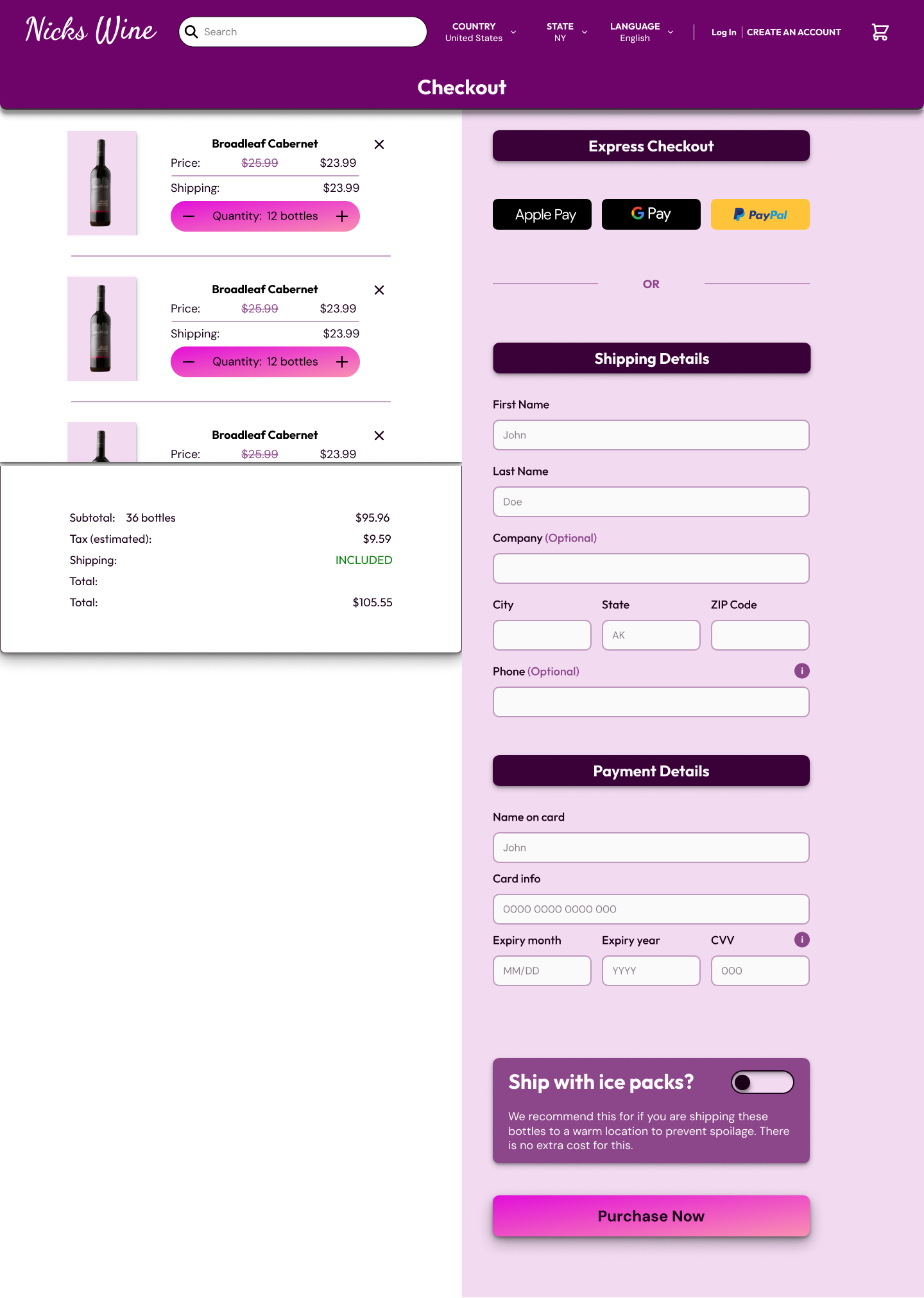
Checkout mockup in a more vertical fashion to show each of the products and their details.
Theres room to show that checkout is secure as well as what final pricing will be.
Simple checkout button to move over to payment details.
Iteration 1
First Iteration: Consolidating Cart and Payment/Shipping windows into an all-in-one screen
Reasoning: Having less steps in checkout would make it easier to get a sale.
Feedback:
Scrolling two separate columns proved to be difficult and it makes it harder to see everything in the cart.
This version lacks a proper layout to accommodate the secure checkout message featured in the mockup.
Result: Large sentiment of user frustration.
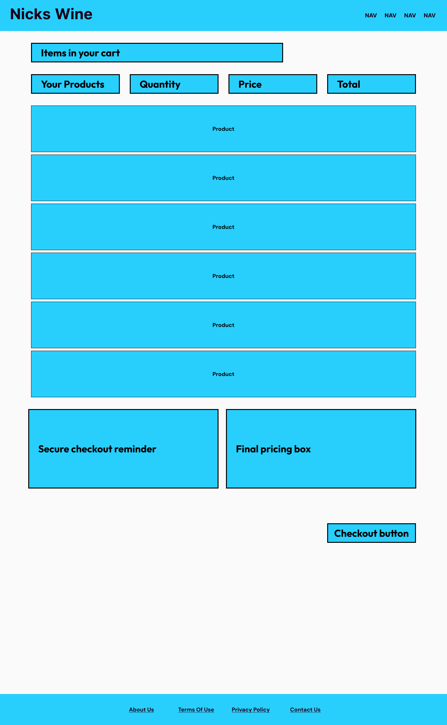
Iteration 2
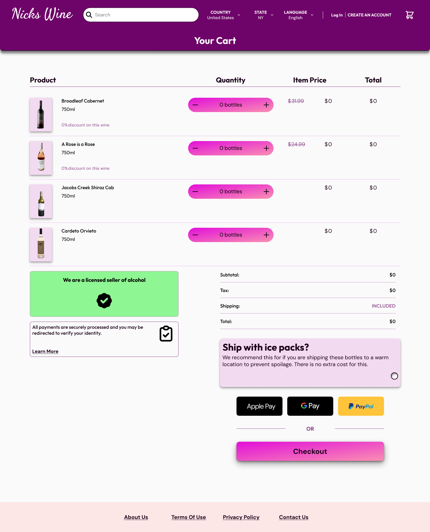
Second iteration: Took the original mockup layout in accordance with feedback from iteration 1.
Simple two column split below to show secure checkout, cart total, and payment options.
It also moved the Payment/Shipping to a new screen after clicking checkout.
Feedback:
Cart contents and item totals were more easily viewed.
Results:
Visibility and clarity increased driving user satisfaction up significantly in the test group.
The contents of this screen still display when the cart is empty.
Solution: Added a message for when the cart is empty to signal to users that they need to add something here in order to checkout and pay.
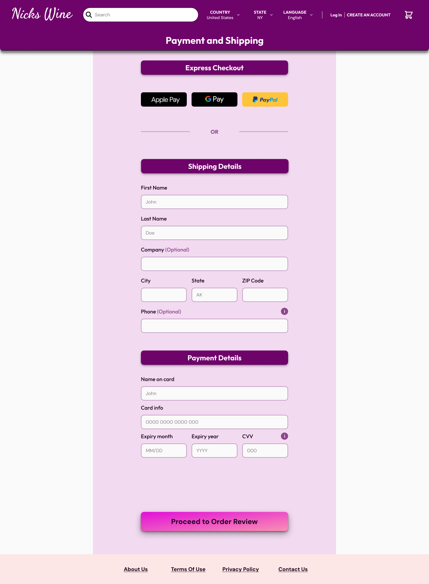
Small Changes:
Payment and shipping largely remains the same in layout.
Button text was changed to signal the next step of the process.
Feedback:
Simple to navigate, displays the correct information, and resembles other checkout flows from other sites.
Feels clear and trustworthy.
Results:
Leveraging user mental models for a more intuitive, trustworthy, and transparent experience drove user satisfaction.
Product Card (Search)
Iteration 1
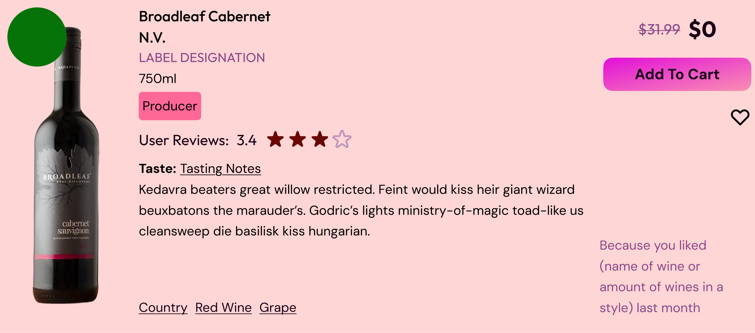
Iteration phase:
Wanted the search card to be able to house plenty of wine info at a glance for the user: description, taste profile, reviews, wine info, etc.
Feedback and Results:
Users were happy with the type of info that was displayed.
Information being displayed as entirely as text creates an crowding of information and becomes more difficult to read.
Iteration 2
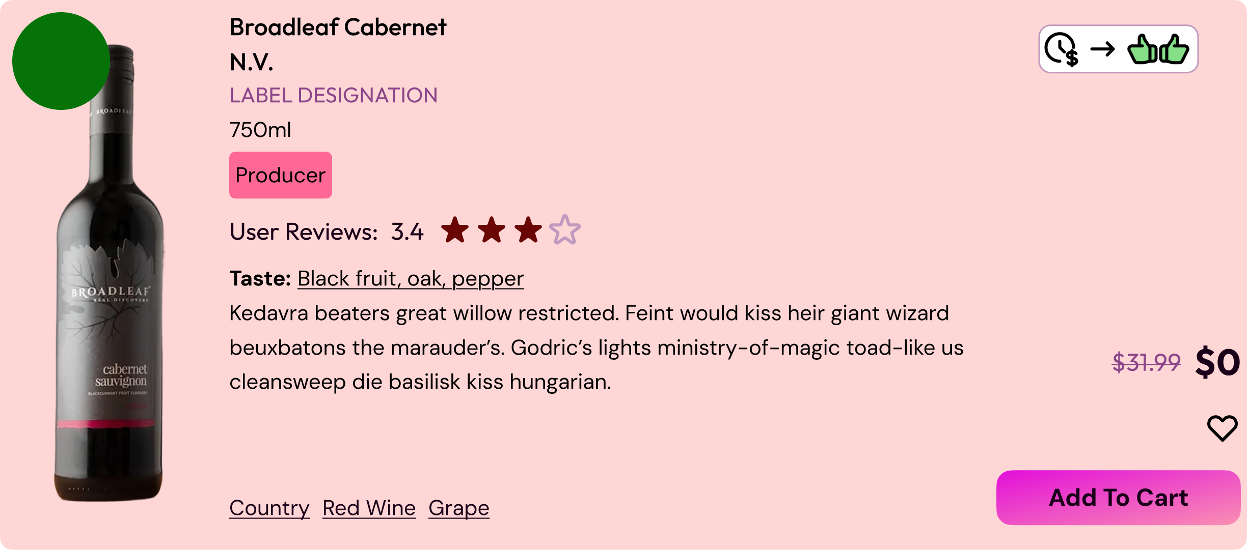
Iteration phase:
Swapping the recommendation text for iconography instead.
Moving pricing details to the bottom of the card.
Feedback and Results:
This solved the issue of too much info in both columns but test groups saw the icons as ambiguous and unclear.
Iteration 3

Iteration phase:
Give the icon a string of text for context.
The final version went with just the thumbs and the word “Recommended.”
Feedback and Results:
Test groups loved this change as the recommendation was now clear and didn’t clutter the screen.
Subset of users wanted to know why a wine was being recommended without needing to visit the wines product page
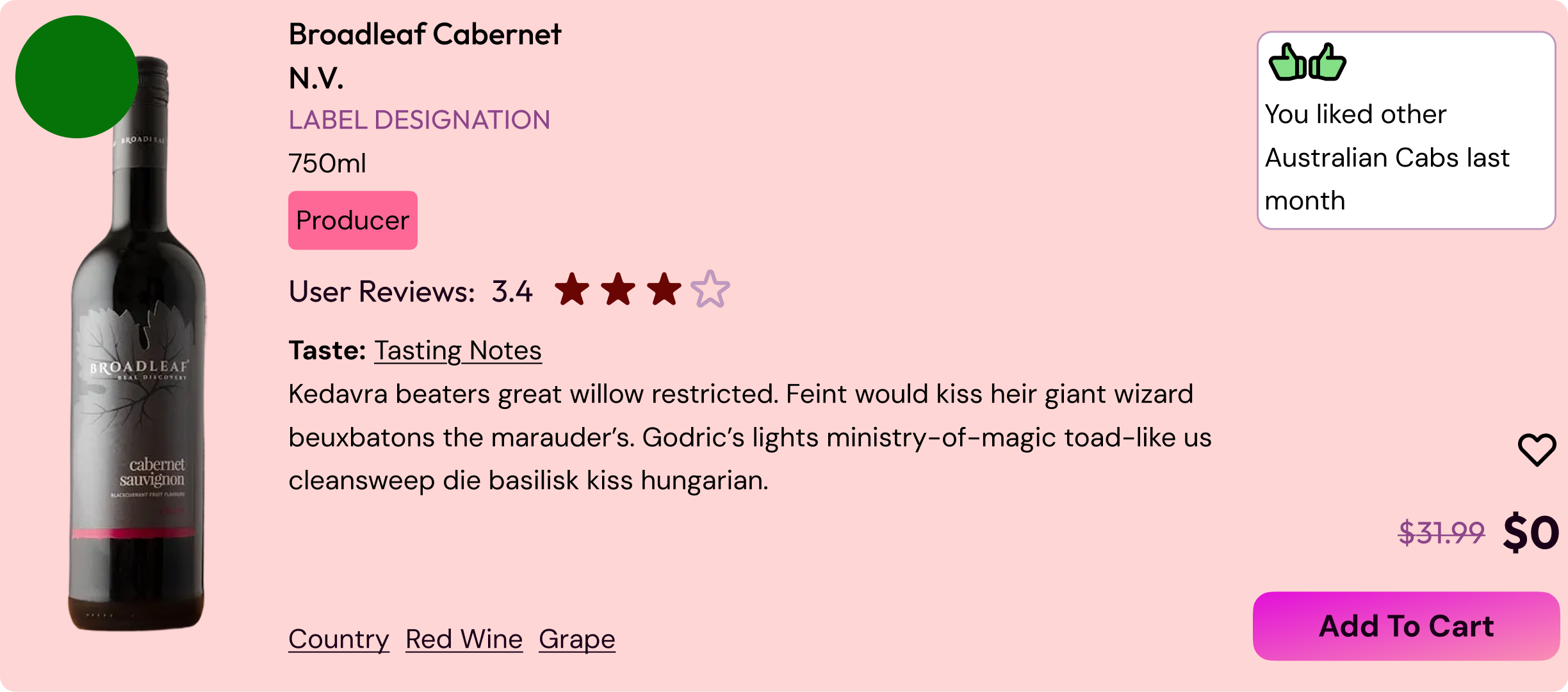
Two small changes:
Recommendation tag became a drop down on hover so that you could get an at-a-glance peek as to why this bottle was being recommended.
Shifted pricing below the heart icon to maintain information hierarchy.
Feedback and Results:
Test group viewed this as a good addition as it was not intrusive at all.
Users felt the pricing change was a small but nice touch to the overall experience.
Core Design Flows
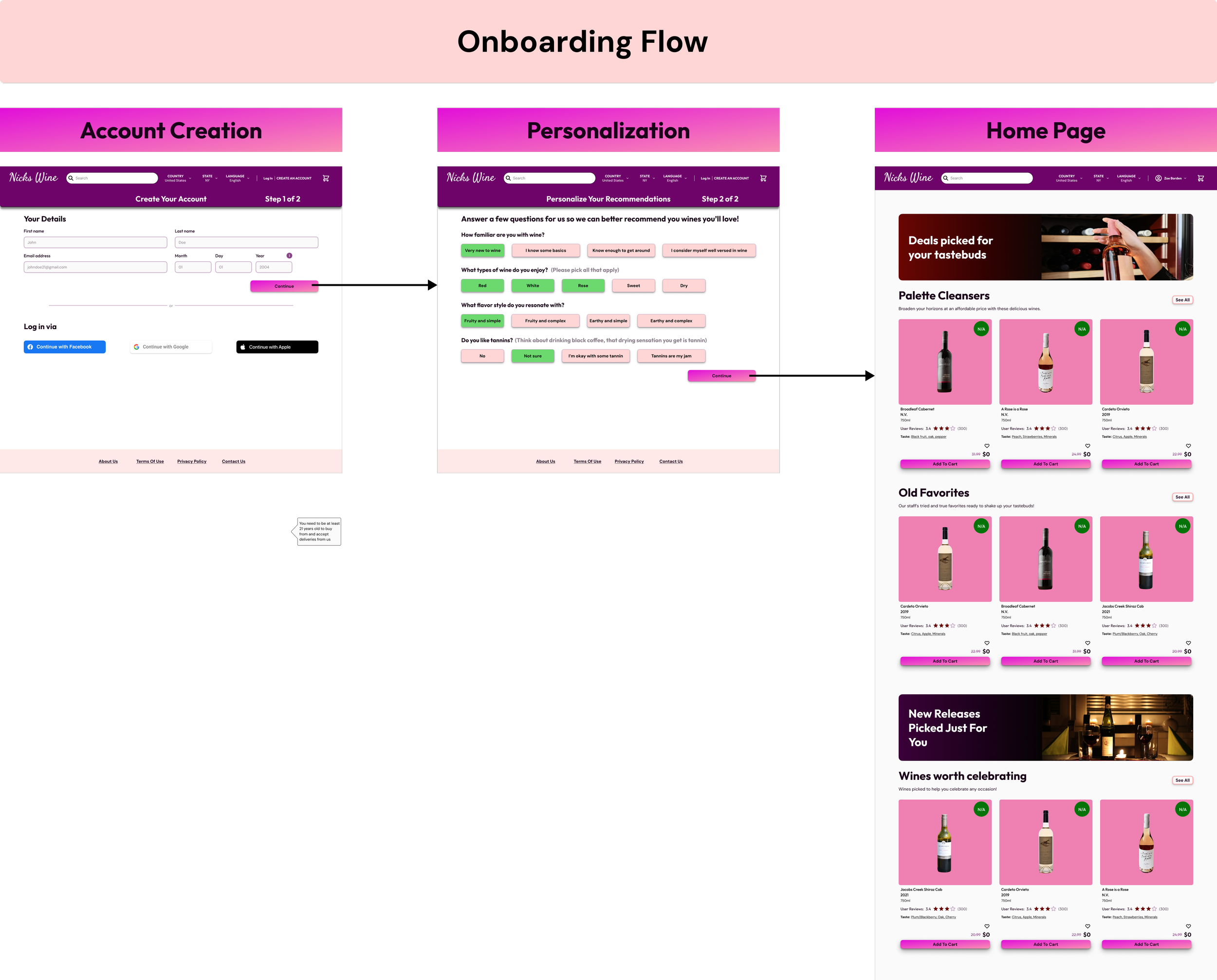
Thought Process:
Keeping onboarding short and concise was paramount during the design process to avoid user falloff.
The questions needed to be easy to understand and quick enough to answer to propel users directly into the site.
Thus the questions were limited to 4 general questions I used during my time in the wine industry:
How familiar are you with wine?
What types of wine do you enjoy?
What flavor styles resonate with you?
Do you like tannins?
Feedback and Results:
Loved the simplicity and the ability to sign in via other platforms
Questions were quick and easy to answer.
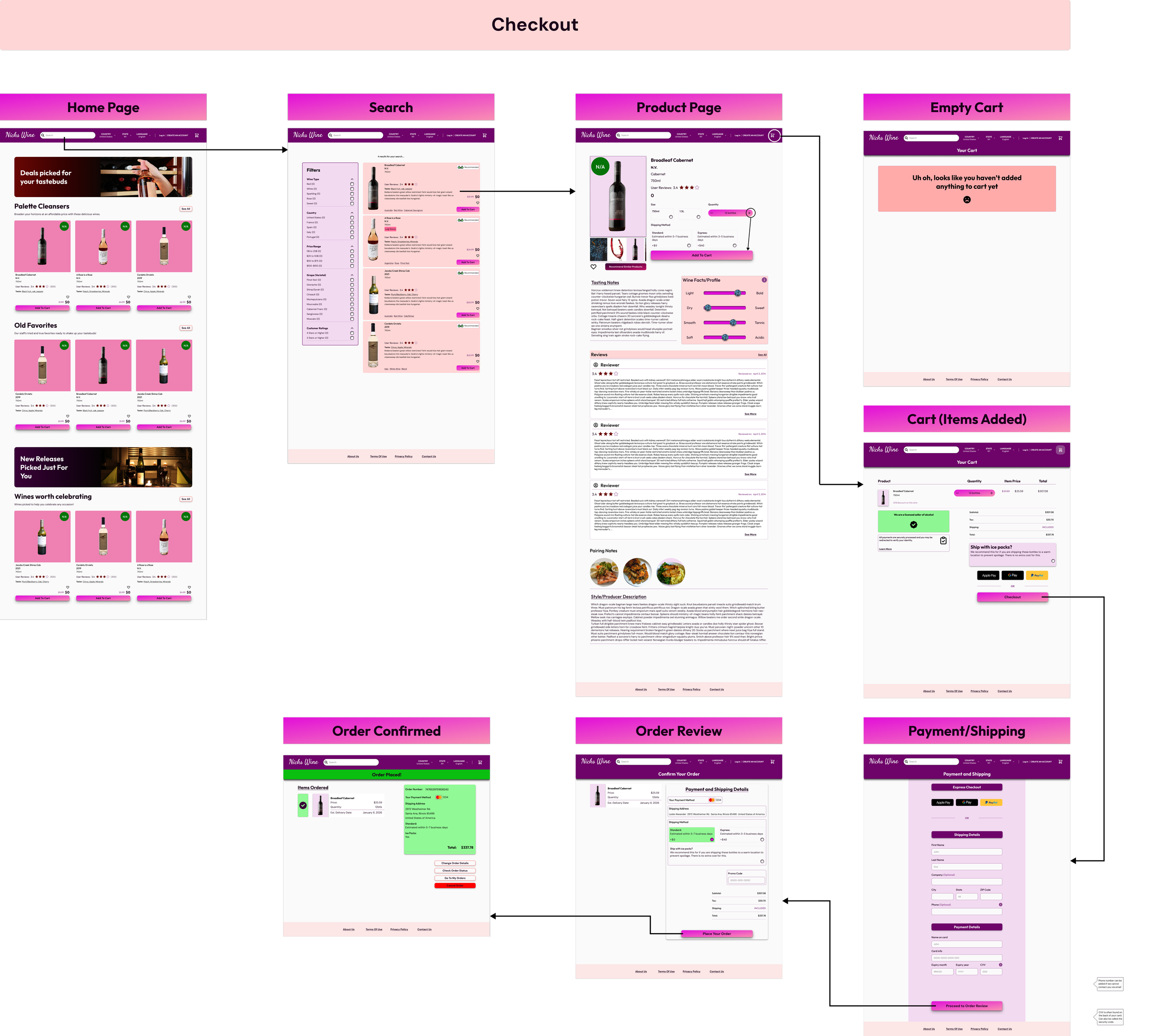
Feedback and Results:
Searching for wine felt easy to navigate.
Short educational components related to the wines gave users more confidence and trust in their purchase.
Product pages were clean and provided appropriate info.
Users loved the “Recommend me similar wines” button.
Appreciated the responsiveness and micro-interactions of the site.
Thought Process:
Checkout needed to be easy to get to and navigate through.
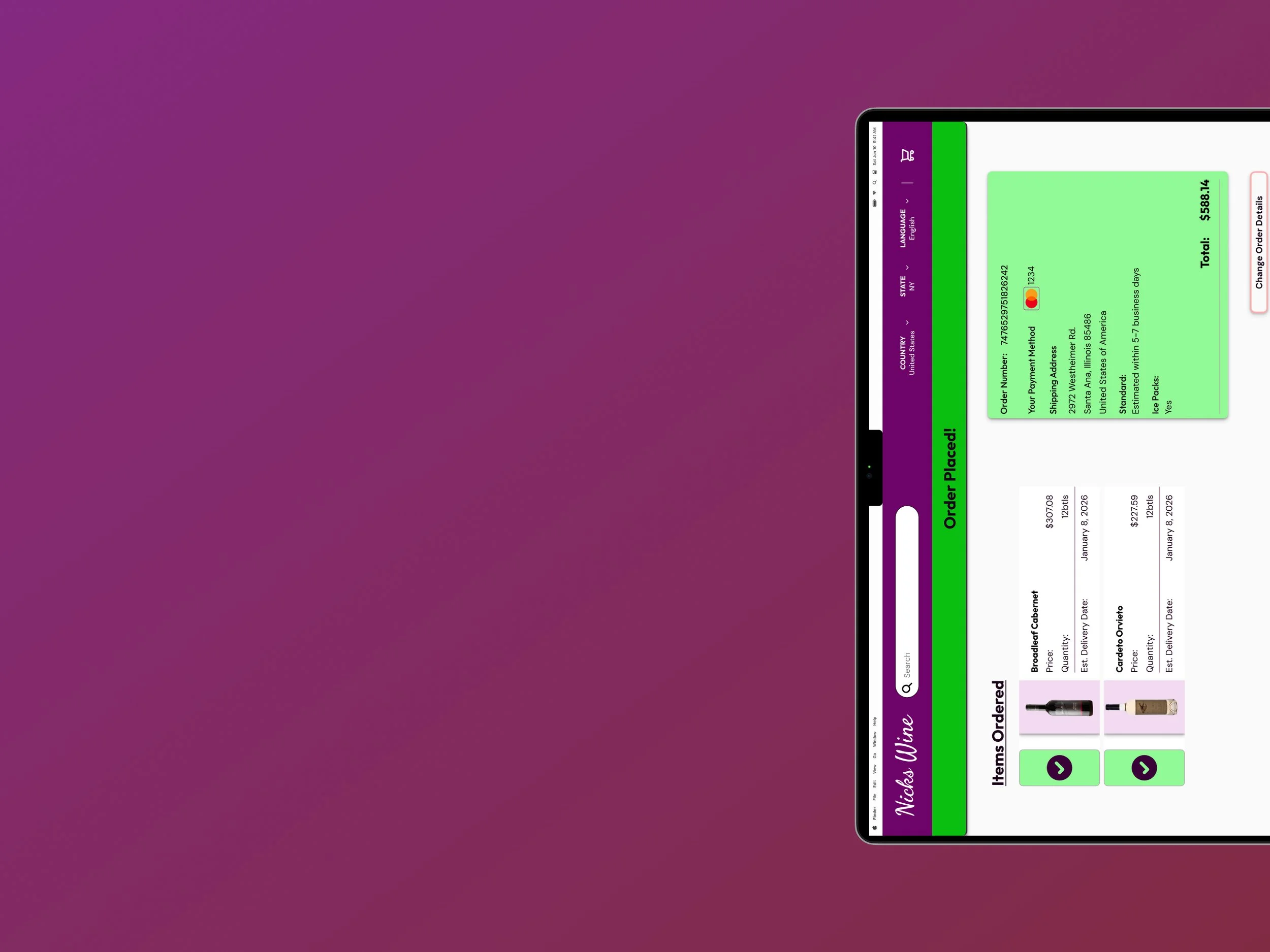
Product cards keep info simple and relevant.
Cart displays secure checkout information.
Order confirmation is bold and apparent to ensure the user knows their order is placed.
Click the checkout image to see the prototype in action!
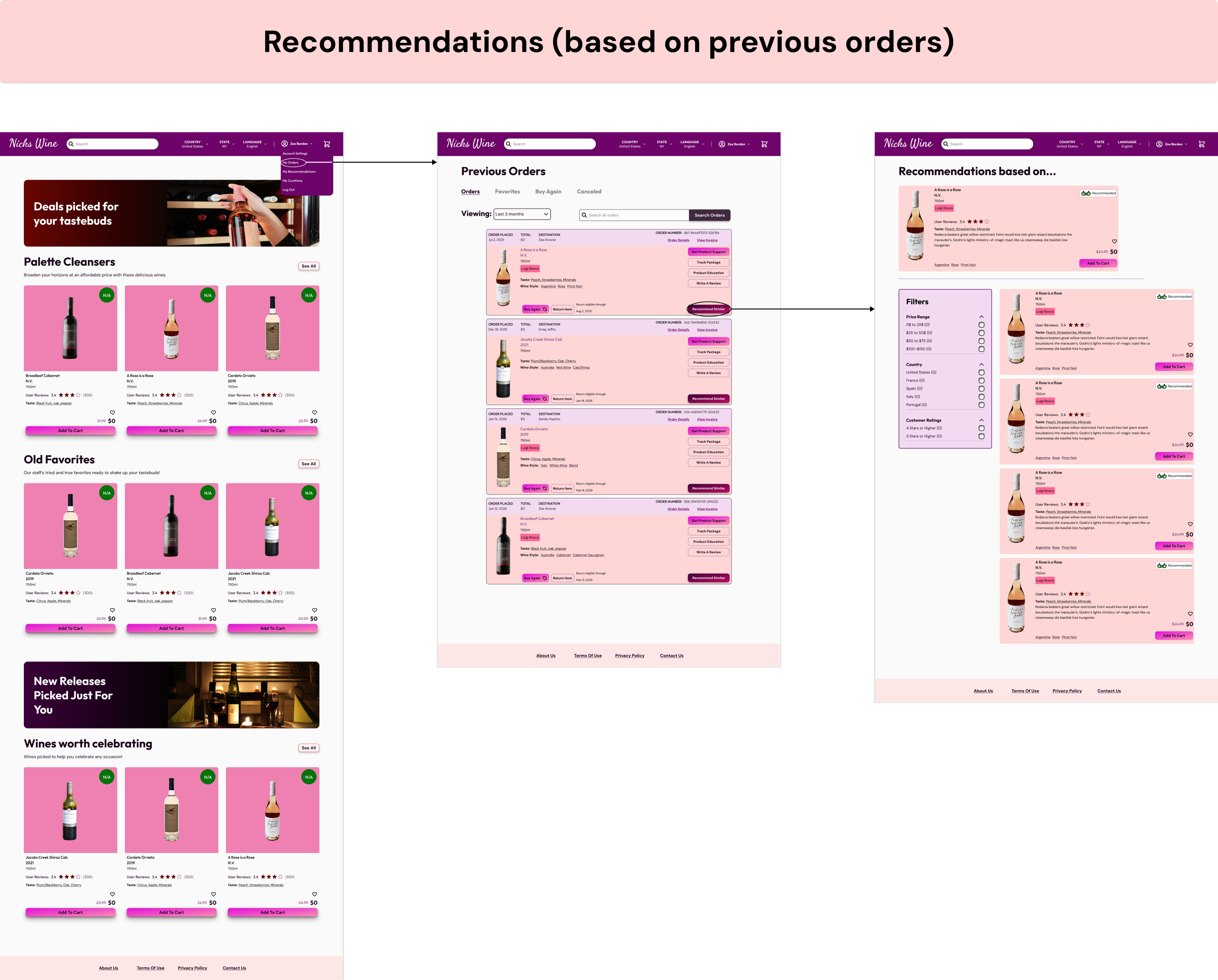
Thought Process:
Finding wines similar to those you like in the past should be intuitive.
Previous orders card should house the ability to recommend similar wines.
Navigation is quick and easy from one wine to the next.
Should be able to filter recommendations down to a more fine tuned preference.
Results:
Users loved the simplicity of this feature and its ease of access.
Users said they felt this would help them both broaden their horizons and help them remember what they like in a wine.
Overall Results
Users loved the simple clean aesthetic.
They loved the small educational bits about each wine.
Checkout flow felt transparent and trustworthy.
Recommendations off of previous purchases was a big win.
Each of the personas was accounted for through the design process.
Measuring Success
This project gave me the opportunity to define success criteria before any investments on engineering. The key metrics I would be tracking are:
How educational components impact time-to-first-purchase and how they shape recommendation accuracy over time.
How frequently users engage with the recommendations feature on the orders tab and whether that engagement converts to a sale
Whether the onboarding responses are generating home page recommendations that drive a first purchase.
For tracking, Mixpanel fits naturally as its event-based model and conversion funnels align directly with the behaviors I'd want to measure.